The topic of discussion in this blog will be board games, and will be exploring different aspects of graphic design and how they are used well, and how they aren’t. This first post will focus on typography and will analyse what it argues to be good typography before moving and redesigning what could be considered bad typography. Baines and Haslam (2005) state that typeface and typography are designed to convey a message. When looking at the cover for the game Power Grid Immediately it begins to tell the audience what it is about. It provides a very basic concept but still it contains meaning behind its use. The typeface and the size of the lettering is reminiscent of industrial era style posters, with the elongated letters capping off both sides. This informs the audience of the genre and theme that is within. The contrast in cursive type for the author’s name helps to separate the information easier to the viewer. Immediately they become aware that the information is similar but not relevant to each other. Upon looking at a section of the rules, it is apparent that a professional view was taken, the spacing and kerning is all even with the information being presented in easy to follow format. Different heading are highlighted by an inverse use of colour, which again will provide easy eye drawing to relative information. Although it is being argued as good, one concession to make could be the overall size of the type. Generally in this format the information needs to be presented in the easiest way possible. Bigger typefaces can achieve that in an easy way.


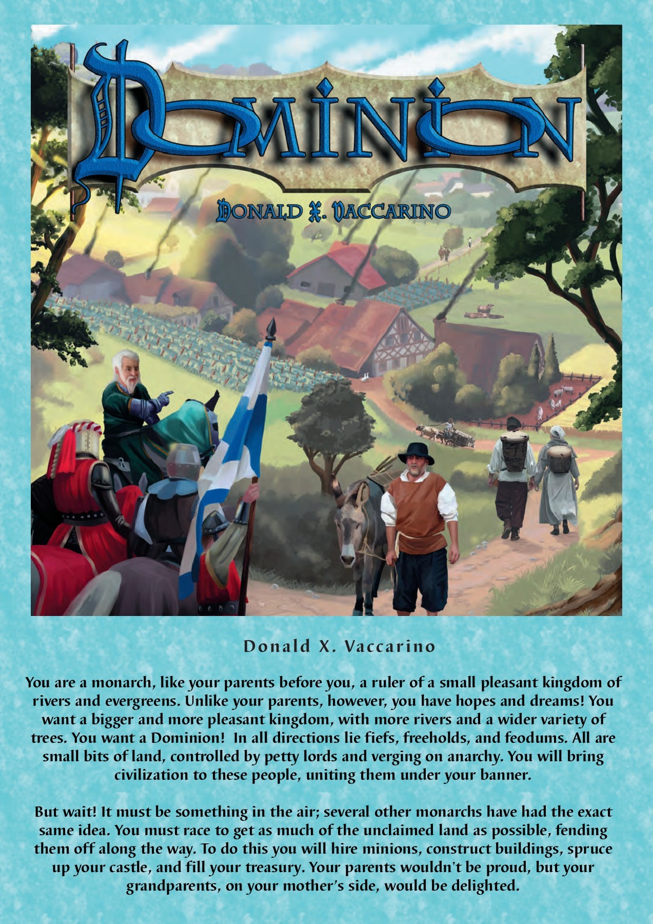
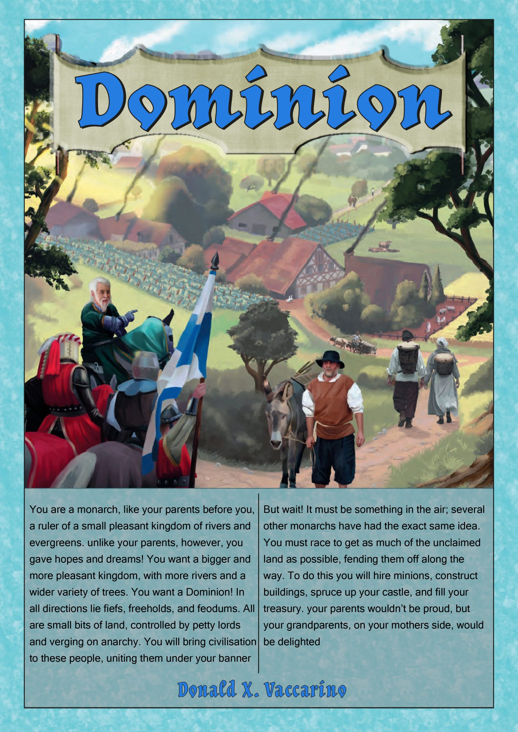
The bad example being used is for the board game ‘Dominion.’ This is a resource management board game set during a medieval period as the player is expected to build up a settlement through various game mechanics. The first issue with this is the title ‘Dominion’, the interlockings o’s make it feel difficult to read and don’t provide direct focus to anything within the game itself. In the redesign the focus became making it easier to understand. A cleaner yet less decorative font was chosen, acknowledging the original felt more of an artistic decision, during this redesign the objective was to make this “good” through making it more accessible. The next change was a simple adjustment of the designer’s name. It was redundant being on the document twice. Matching it to the font was intentional to highlight its importance within comparison to the games title. Its location was moved to isolate it more and again present it as important information. The main body of text was lacking in being prominent enough, it becomes easy to get lost within the textured background it sits on. The obvious answer appeared to be redlining the text through the use of an added box, this was done with the intention of giving natural eyeline for the readers eyes to fall to in an attempt to present the information in an easy to read way as per the personal goal of this revision
- Baines, Phil., Haslam, Andrew. (2005) Type & Typography. United Kingdom: Laurence King
- Donald X. Vaccarino (2008) Dominion Available online https://fliphtml5.com/dqxm/qxlo [Accessed online 13/10/2022]
- Friedemann Friese (2008) Power grid cover Rio Grande Games Available Online https://www.riograndegames.com/games/power-grid-recharged/ [Accessed Online 13/10/2022]
- Friese, friedemann. (2008) Power Grid Rules excerpt Power Grid Rio Grande Games Available Online https://www.officialgamerules.org/power-grid [Accessed Online 12/10/2022]