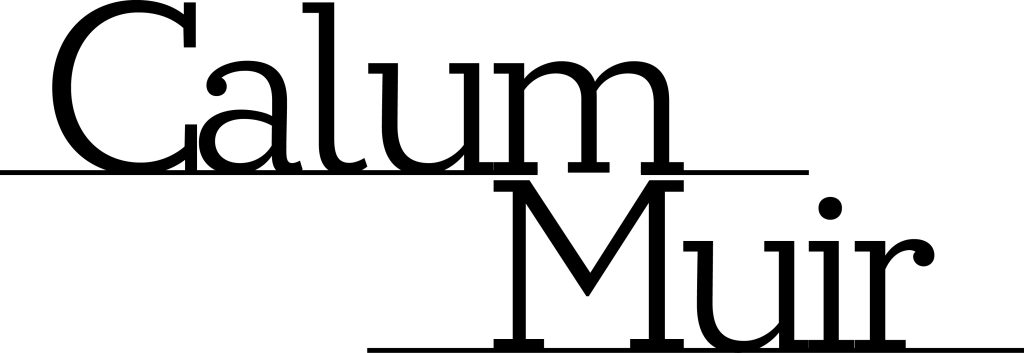
The approach to the first design was less of a set course and more of a discovering journey. Having zero idea where to begin to overarching deadline forced pen to paper and the idea was to produce something, anything that could fit within the parameters of a typographical name logo. This is how we arrive at the final piece of the first edition. Simplicity was key and not much experimented on with what was available. A simple use of efficiency to combine the m for both first and last name with a sans serif font shows an idea of what could be achieved rather than what has been achieved. The choice for a serif font was due to wanting an easy canvas to work with for letter spacing. All in all this became a good place to start from; with the second design, the inspiration for improvement was shown. Creating something easier was not an option, there was more of an opportunity to search for connections between the letters. Choosing how they fit together became important, with that the layout now was deliberately done to highlight the m’s, there was an opportunity to use the negative space to the benefit of the logo. The rest of the spacing and layout was designed around that as the main piece. One final note to mention, was the difficulty to really express myself through this design, so i would like to highlight that the font choice was helped by the leftward strokes on the lowercase letters. Being left handed I was inclined to choose this font as a way to put some part of myself across.