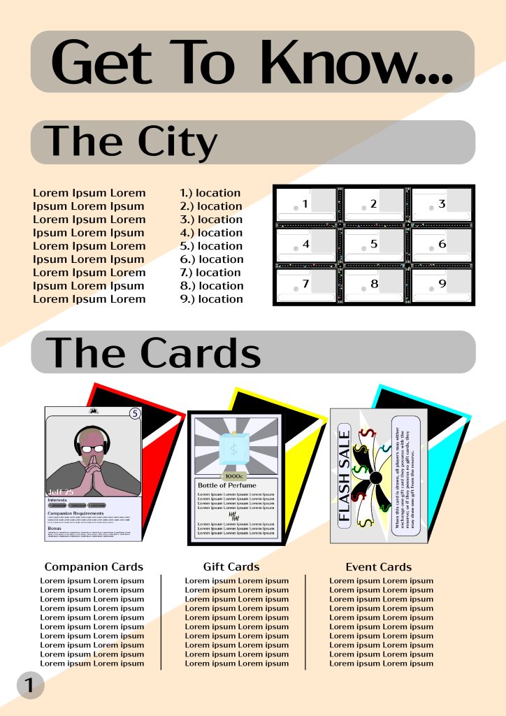
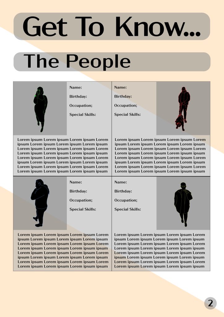
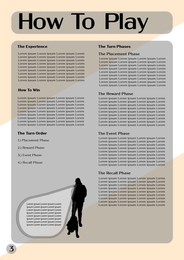
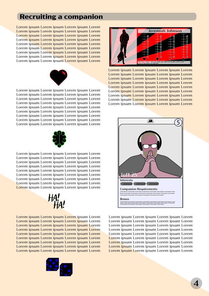
For the editorial information pages I have designed the first four pages of the rulebook for Affinicity. Trying to conceive an idea for this I took inspiration from one of the cover designs and decided to pursue the theme of the travel guide. The design process then began by arranging the layout of how the information was to be presented. The font decision was based on the font within the lamppost logo design; Acme Gothic Wide. Once the titles and text placeholders were positioned the composition was adjusted as the nature of this type of editorial information requires the use of images alongside text to correctly convey information. The colours used were chosen due to the neutral colours, as we were taking information from a travel guide, it was noticed that most used white or similar as the background for dark text to be clearly written on top. Knowing the game uses strong colours throughout the pieces and cards, neutral colours were used to prevent any clash within the document between the elements. A stylistic choice was made to use a basic pattern of white and beige purely for aesthetic reasons. The approach to the target audience and purpose, the purpose of this document is to provide information on how to play the game. The easier someone can interpret the information, the better, in that sense the document was designed to provide that easy to read and understand format. All text is located in logical locations presented together with all other relevant pieces. The audience is a difficult subject as the audience of the rules would be anybody who is an audience of a game, it could be argued that the audience of rules is less important than the purpose. However, in a hypothetical scenario of a professional environment it would be that the audience of this would be whoever were to be higher up in position, so in that sense it would be presented as a concept design before the final product. In both instances it would achieve its target audience reasonably.


