Within the field of architecture “Brutalism” is a modernist style from post World War Two. A focus upon functionalist design, geometry and exposure of structural materials (Brockington & Cicmil 2016) A simplified interpretation of this is concrete buildings similar with a heavy geometric shape of cubes, square, and rectangles. The Buffalo City Court Building is a monolith of an example of brutalist architecture. Standing tall as a 10 story high rise building, it has been claimed as “the epitome of brutalist architecture” (Architectuul N.D) Brutalism was an architectural style that is argued to work best when you think upon a grander scale. Lending itself to the design of larger residential complexes, it consequently was used worldwide for public housing developments (Brockington & Cicmil 2016).
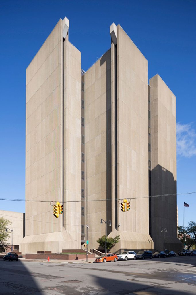
With an association with cruelty and inhumane methods, the word brutal has established connotations within society. The lack of decoration and colour is what provides a brutal feeling to these monolithic structures, and yet the popularity adorned through their use is still prevalent in modern day. The strive of functionality as a component is an idealistic one, acknowledging that the reasoning for the placement and minimal use of windows in the Buffalo City Court Building was to minimise potential distractions to the courtrooms from outside. While functionality is useful and popular there is a style that wants to reject that ideal.
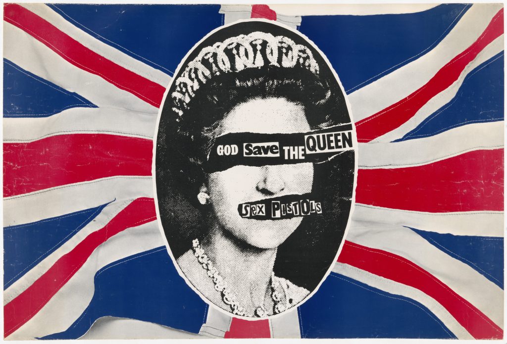
Punk is the embodiment of “do it yourself”. During the original rise of punk style, the apparel was often pieced together and self made (Sklar 2013). It is important to note that there is no sense in simplifying punk design to basic terms, to understand the essence of it is to take the cultural movement as a whole. Within that holds this do it yourself mentality, a rejection of authority, and rhetorical strategies including parody (Bestley 2017). These beliefs were not limited to one aspect of “Punk” ; everything from music to fashion to graphic design seems to carry this mentality.
Raymond Pettibon was the artist responsible for the artwork for the American Punk band Black Flag’s album “Slip It In” (1986) The visual of this cover emulates a lot of those ideals that fill punk design. With an ideal that punk holds a belief of self expression, it is a belief that graphic designers, specifically those that worked with the music industry during this era of prominence would take their designs as an opportunity for creating the definition of that band’s identity. Generally Record sleeves would need to convey they contained punk music within, but designers would often strive to achieve a motive similar to branding within the band in relation to the designs (Bestley 2020). It seems apparent that a lot of these unique styles come from challenging pre established rules of art and visuals.
Anti design is a modern digital design style that challenges the notion that users live for a thoughtless experience, With its modern relevance it shares similarities with other styles that strive to challenge existing aesthetic conformity. Levanier (2022) states their belief that “anti designs approach rejects convention and traditional aesthetics, in favour of challenging, innovative layouts”. The earliest notion of an Anti design movement was in italy during the 1960s, this movement emerged as a criticism of consumer culture and as a comment on “excesses of Italian design” (Widewalls 2016). These two versions could arguably share the same ethos. If the modern anti design is a question against what users actually desire, and consumerism is an aspect of society that directs and influences others, then there becomes apparent a similarity between the two.
References
Architectuul (N.D) Buffalo City Court Building Available Online https://architectuul.com/architecture/buffalo-city-court-building [Accessed 20/07/23]
Bestley, R.. (2017). Art attacks: Punk methods and design education.
Bestley, R., 2020. Kicks in style: A punk design aesthetic.
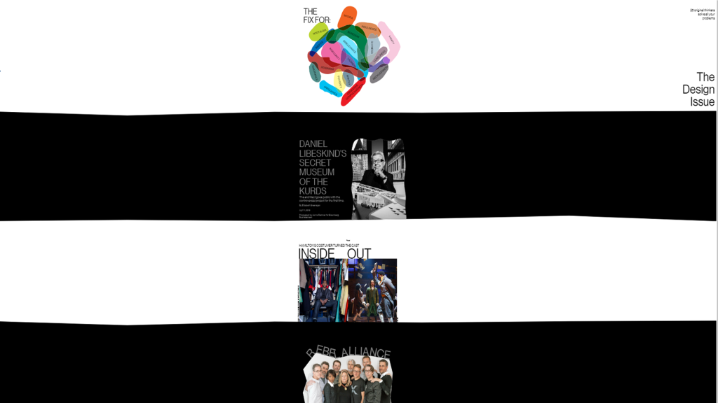
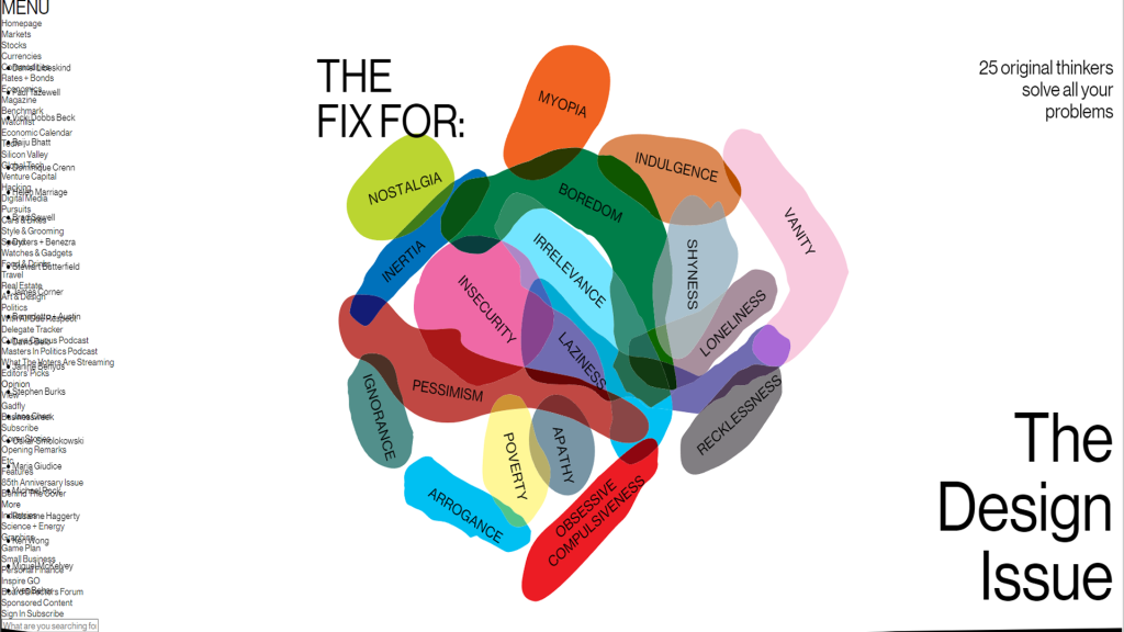
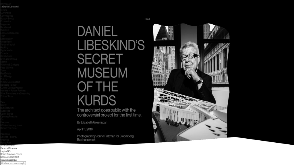
Bloomberg 2016 The Design Issue Available Online https://www.bloomberg.com/features/2016-design/
Brockington, R. and Cicmil, N., 2016. Brutalist architecture: an autoethnographic examination of structure and corporeality. M/C Journal, 19(1).
Jamie Reid 1977 Sex Pistols “God Save the Queen” Album Cover. Photo Available online Museum of Modern Art https://www.moma.org/collection/works/156133
Pfohl, Roberts and Biggie 1974 Buffalo City Court Building Photo Available online https://api.architectuul.org/media/5ae179f1-5d30-4ef0-ae0b-7cef6d7b5e1b/1312x.jpg
Sklar, M., 2013. Punk style. A&C Black.Raymond Pettibon 1984 Black Flag “Slip It In” Vinyl Record Cover. Photo available online. Museum of Modern Art https://www.moma.org/collection/works/191021