Exercise 3
In the third exercise there is the focus of incorporating UI and UX design, alongside user-friendly interfaces within Adobe XD. It is commonly known that good UI and UX is a major selling point of how successful web and app design is. By making an engaging and memorable experience, not only do you keep the consumer interested and engaged, it creates a stronger memory which is inherently linked within the product or service the designer is working for. In XD a major functionality of that comes through the use of components in the design software; a component is best thought of as a mechanism of engagement that can be interacted with by a user to some degree that offers a tactile response and oftentimes navigation within the website or app. Appearing commonly as buttons or toggle switches these components are important and Adobe XD allows custom and detailed customisation and editing of these to suit the user. Creating a component is as simple as selecting the relevant icons or shapes that have been made and clicking a button to give it the ability to be edited with different states and visuals. With the library and asset function, a designer is able to create a series of components that are able to be stored and placed into the document as and when needed, to further into this customisation once a new component has been made, it will become what is know as a “main” component (formerly known as master) this is the source where all new iterations of this component will draw from, which allows for new instances to be edited to the relevant state they need to be in without affecting all of them across the document, and vice versa it allows the user free access to edit the main and affect all instance versions of the component. The functionality and accessibility is only enhanced with the ability to replace components similarly to how the images were replaced in the earlier tutorial. Adobe XD does an objectively good job at keeping its technical methods similar in practice for the user.
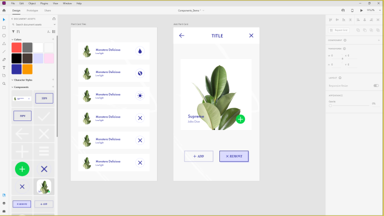
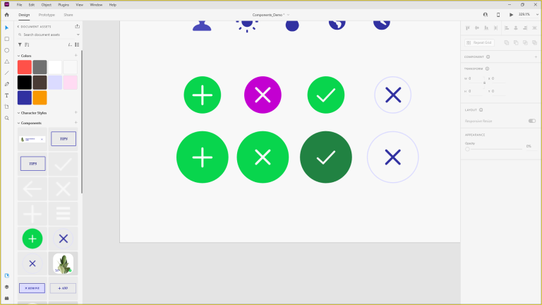
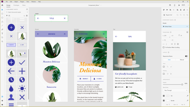
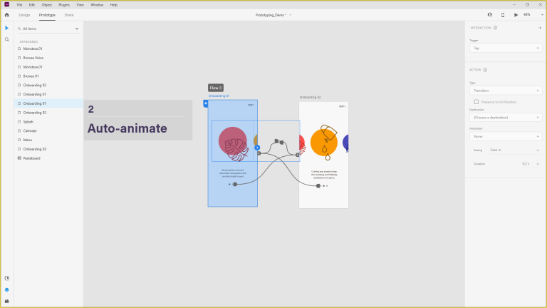
he tutorial used started by creating a component to apply it across different artboards and showed the simplicity of adjusting them for different aspects, in this it explained the use of XD and its responsive design ability, which allows the user to control individually how aspects of a component will perform upon reshaping and resizing, which will allow a much more streamline and user friendly experience to people who have to view the content on different types of devices. A follow on step after discovering the capabilities of components and how easy it can make editing and changing different parts is what is referred to as nesting components, which is effectively a component grouped within another component. Within the tutorial that was followed for this exercise, the objective was to change the icons of the nested components to represent different actions, in this the colour was also changed as a way to continue to show the different customisation that is available at the designers fingertips. This can be helpful to offer more detail within the interactivity, used in combination with states; there are multiple states which will affect the functionality of how the component works. Default, hover, and toggle, Although the tutorial did not touch on the toggle state much, personal experience knows it as a way to create switches in design, an example of that could be used for a light and dark mode button as an accessibility feature. In the tutorial there was exploration of the hover state and how its interactivity can be used as an effective call to action for buttons.