Conceptual Energy Drink Animation Storyboard
When storyboarding this animation, the author decided to take a different approach in the final product, to achieve a meaningful and resonant advertisement that embodies the nature of the product and its presentation. Some Additional inspiration and research was undertaken to initiate the framework and idea phase during planning; what followed were two heavy inspirations for this project’s final animation. The first one discussed will be an advertisement for the Apple™ Macintosh™ computer released in 1984. It features a horde of mindless people walking through to a theatre hall where an oppressing figure is talking through a monitor, as the camera cuts and follows the main character, distinguishable by the use of colour in their clothing, runs and eventually throws a hammer into the screen, destroying it in the process. The second inspiration is provided by this Youtube™ video which features a compilation of various bowling alley animations, these animations would often feature inanimate objects that have some type of comedic personality that would play out based on the players results during each individual bowl attempt. Both of these examples have been chosen due to their iconic feel and imagery. A more mature audience will recognise and sympathise with these influences, the goal being to hit that target audience of over 60’s, by choosing something significant from a portion of that age group early adulthood can potentially enforce that nostalgic feeling designed from the first iteration of the brand.
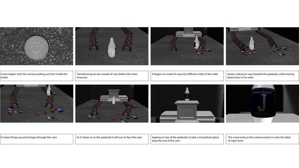
During the storyboard with this evidence and planning done, the story is paced in a way that follows the main character, The bottle of Vigor Brew, as it makes its way through a crowd of cans, intended to be representations of the rival energy drinks in the market. Immediately there are some things to note. The size difference between the brands drink and the nameless competitors, implies Vigor brew is better, and stronger than all the rest. The rest of the scene follows as Vigor Brew barges its way through the crowd, stomping and knocking other cans over, making its way down the runway towards the pedestals in the back. Finally it will launch itself up claiming its place at the top, signifying its superiority and regality over the audience of energy drinks, before revealing another look at its logo and zooming in, fading to black. To finalise, this idea is intended to combine two aspects of memorable media into a combined animation that nags at the subconscious, nostalgia of the target audience; while trying to provide emotion and humanity to the objects, using them as placeholders and representation for humans. The goal of this animation is to be memorable while applying that use of subconscious messaging to imply certain themes and motives behind the brand.