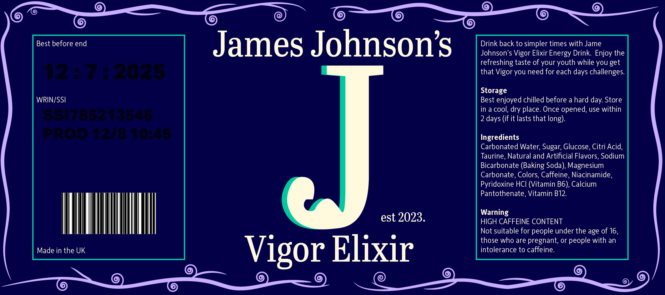
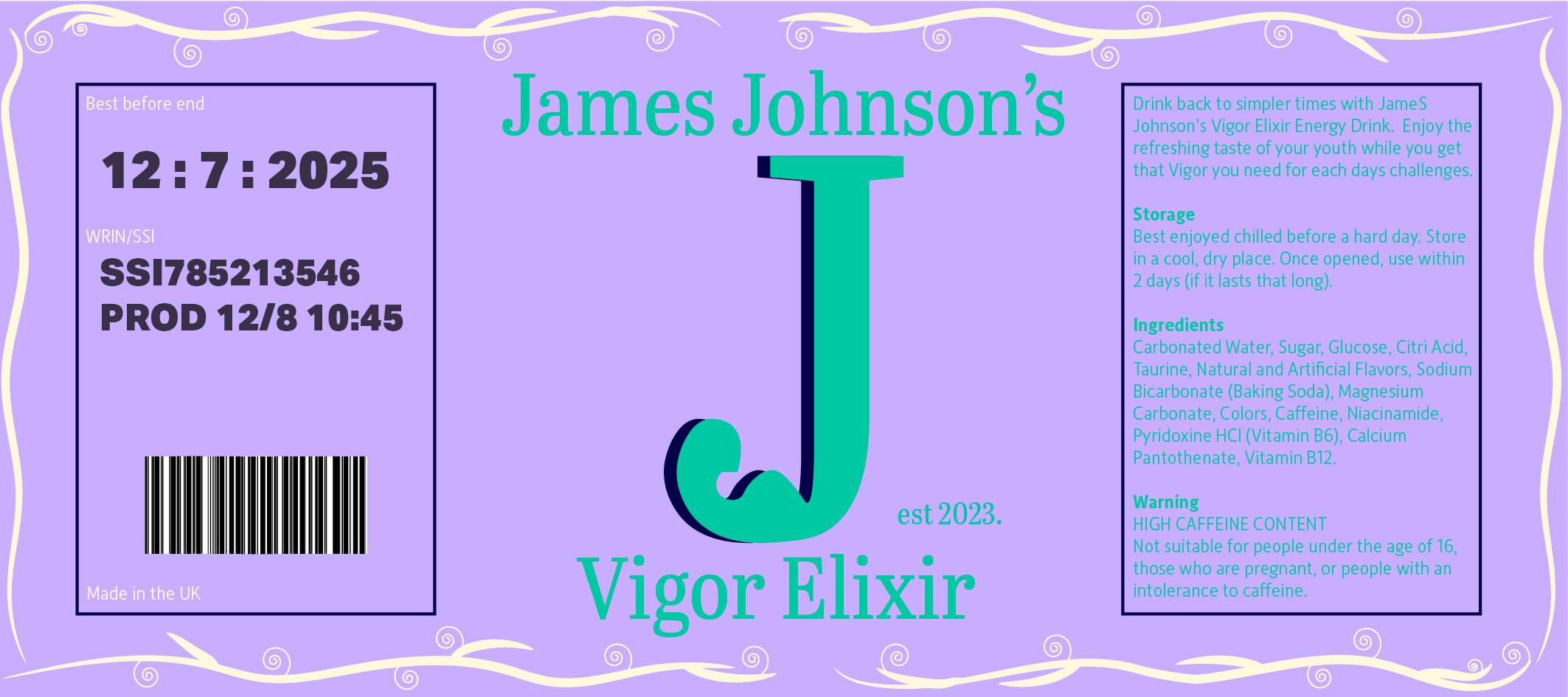
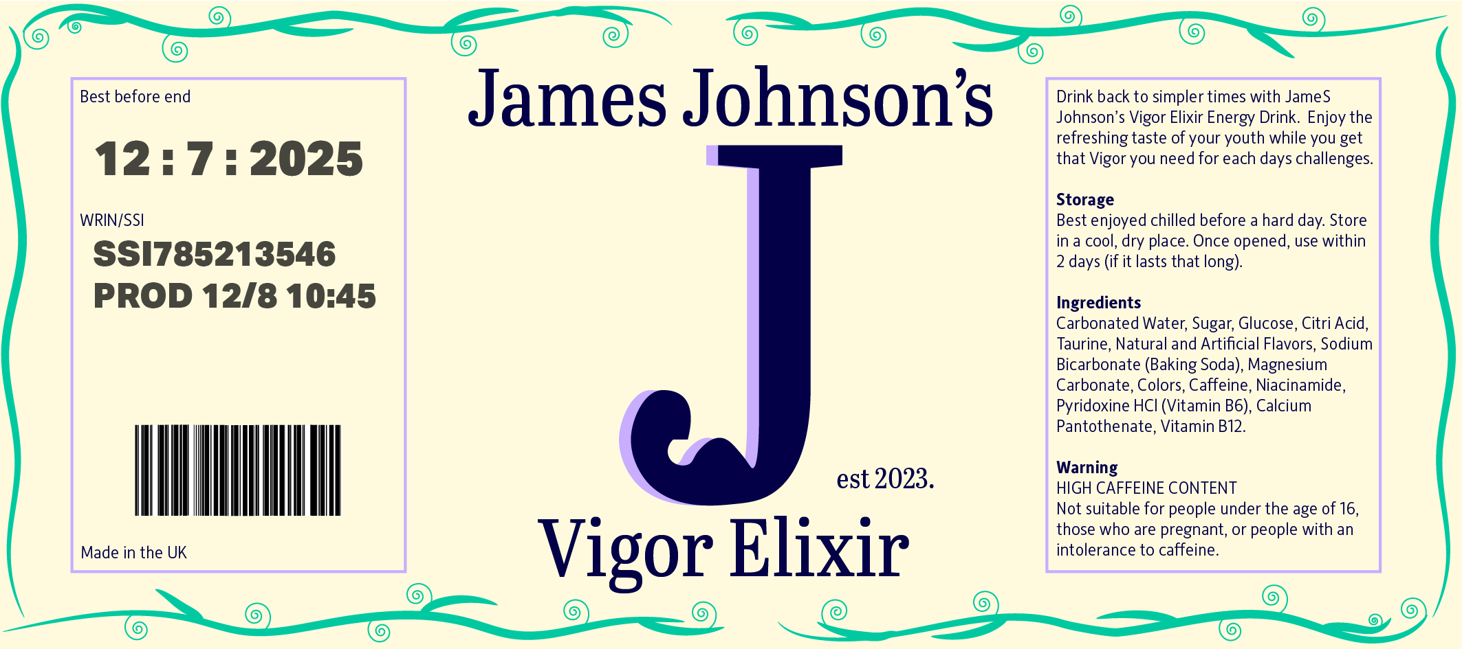
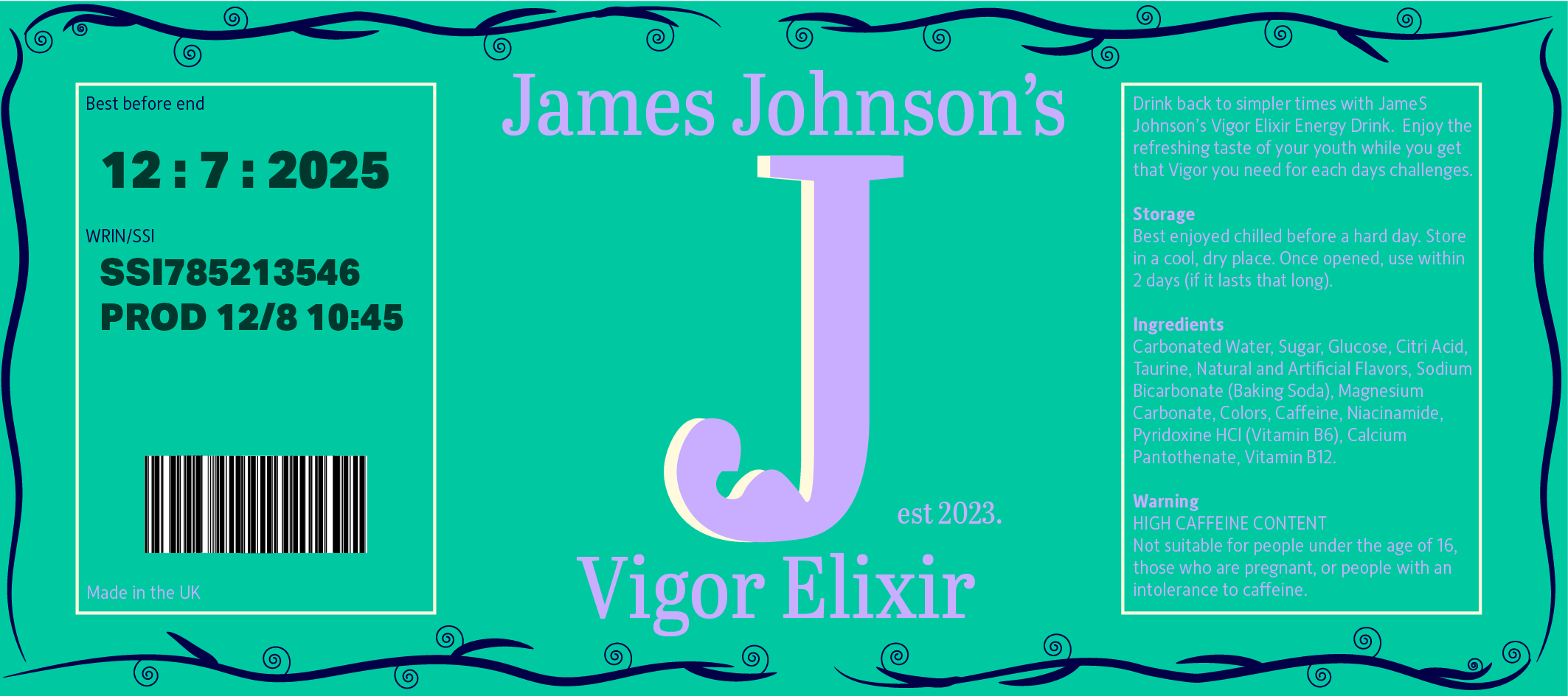
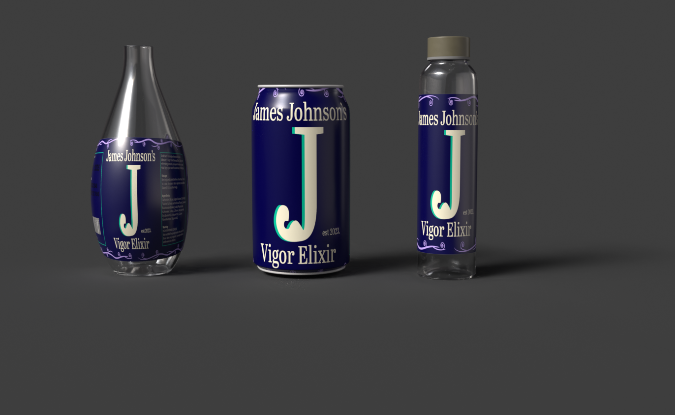
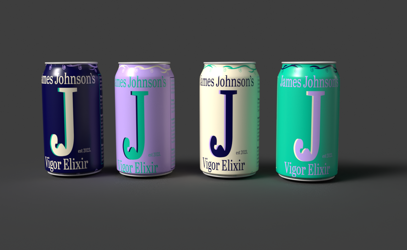
By analysing a few examples of bottle designs and labels that are trying to be recreated there seems to be a recurring pattern of maximalist design, there needs to be complex patterns and visuals that provide the audience with a memorable experience once they have viewed the bottle. Each design has to be more visually represented than the last, as there is the obvious spirit of competition between the different brands and companies. With this design, the intent is to pull back that complexity and provide a simpler visual that explains exactly what the audience is getting while providing a specific memorable moment of interaction. The tagline of the brand is to “drink back to simpler times’ ‘ so to do anything else within the design seems counterintuitive to the product that is being sold. Separating the layout of the logo into thirds allows a perfect space to provide a centre stage for the important information of the packaging, allowing the significant logo to be at the forefront, will help avoid any confusion about the product and what it is, combined with sectioning the other relevant information that is required by law allows a seamless incorporation into the final brand packaging design.