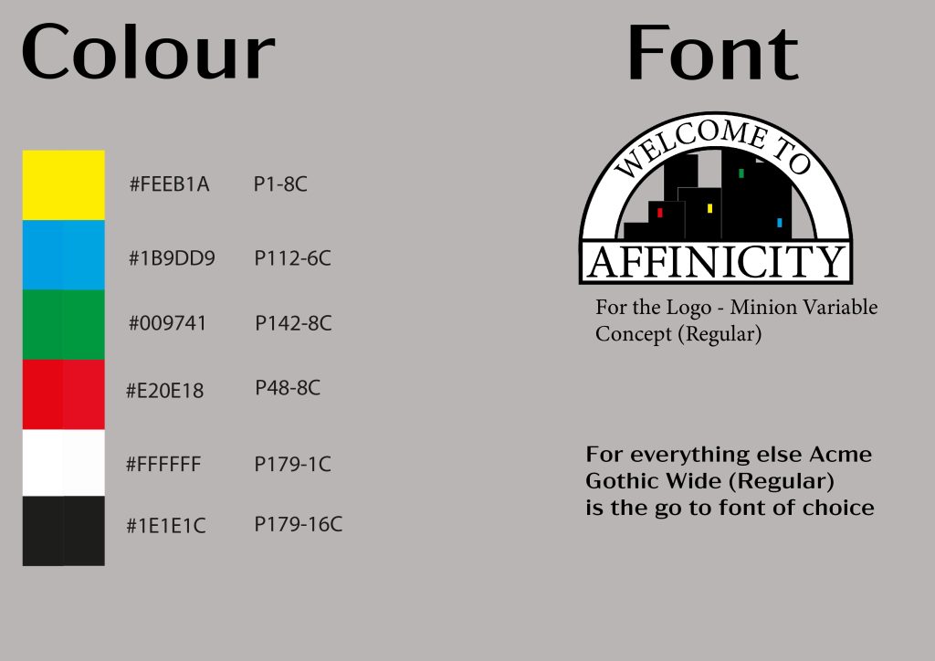
The design process for this was a strange one to figure out. The research that took place yielded some results that allowed me to have a certain guideline and grasp of the concept. As a side note I realise this would have potentially worked better for myself had i been following the magazine concept originally as that would have resulted in me building a hypothetical brand over a product. However , we established the main ideas behind our product’s standards would be the logo itself, the font, and the colours used. So that it was curated and approached within the typographical standards section of this. With these standards it is achievable any media of this brand could be recreated within reason to the standard set by myself the creator. With that the thinking was to ensure all that information was clearly displayed and those important factors were highlighted. Typography and composition were mainly used for consistency and separating information. The font matches the font used within the whole “brand”. The notable audience for this would be anybody needing to recreate this design or for brand advertising purposes, this is achieved well enough.