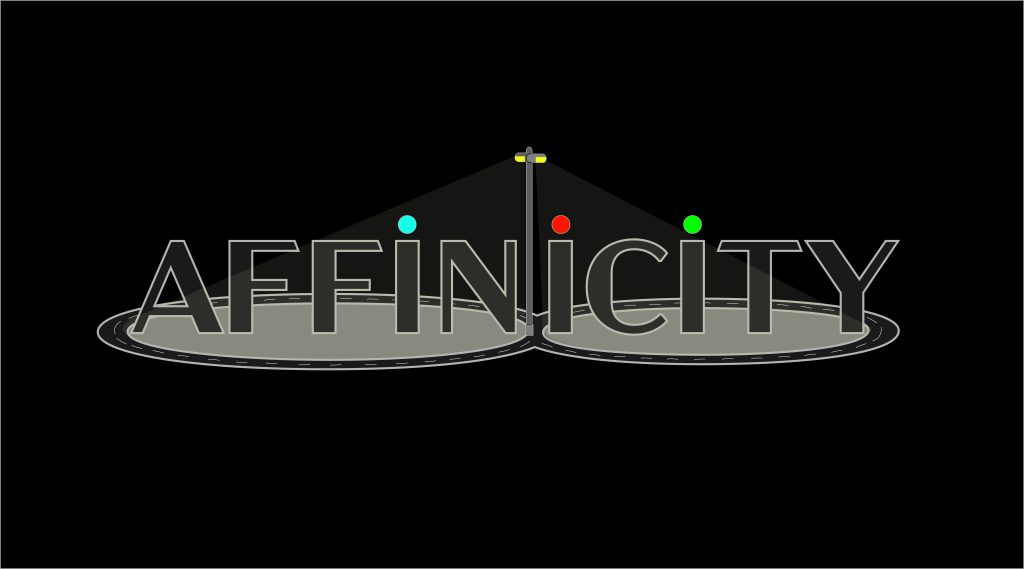
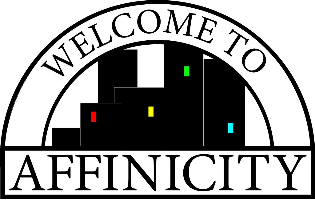
The subject for this topic will be taking the optional approach and instead will be presenting as a board game. The name of this game is Affinicity (Ah-Fi-Ni-Si-Tee) and is intended to be a “meeple-placement, resource management “ game. The intended audience would be two-fold, initially publishers and companies to receive the game and market it, and then the game audience would be board game fans of player vs player strategy and the wider audience of mid teen and older members of the public. The designs presented here are two unique iterations of a logo for Affinicity, the first one shows an original idea and then an updated and approved redesign of that idea, the second presents a different idea completely. A different approach was taken towards each design. The first, which will be referred to as the Lamp Post design from here onwards, was designed with a focus upon an artistic approach. This is a game set within a bustling populous city and the logo needed to reflect that. That led to a font being chosen that was reminiscent of broadway musical signs, once selected the rest of the logo was built around that idea. Another way I wanted to achieve this city feel was to take inspiration from the Hollywood sign and use perspective and composition to make it seem like the letters were standing on the ground. The lampost became an idea to add some colour within the logo and help contrast the letters and was intended to ensure clarity of reading. Overall it was a good starting attempt but it did not achieve enough of what I wanted. The redesign came some time after, but had the advantage of being designed with the previous flaws in mind. Completely designed from the ground up but with the original as a reference point. The main ideas were to give as much information about the theme of the game within the logo. Markings added to the road helped to cement the idea of city infrastructure into the viewer’s mind. Colour was used more here, the four bright colours; red, green, blue, yellow, are the same colours of the player pieces within. The intention behind this was to inform the player subconsciously that this game is designed to be played by four people. Moving onto the other unique design which will be referred to as the welcome sign. Again I wanted to convey as much information within the logo as I could, so taking inspiration from typical welcome signs you may find across cities everywhere. This became the basis for this design, the font used is typical of the font i would see on road signs growing up. So the intention was to help trigger that familiarity within people that had similar experiences to me. Acknowledging how this can have impacts upon the targeted audience; as being a specific niche of people this would appeal to. With that in mind the design process became more of a personal preference. Composition was used to again help solidify that idea of the theme to the audience. Colour was used and inspired very similarly to the Lamp post design, personally i feel it is much more effective in this iteration.


