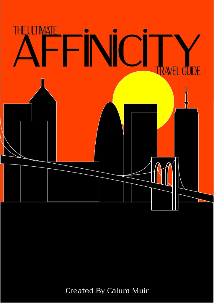
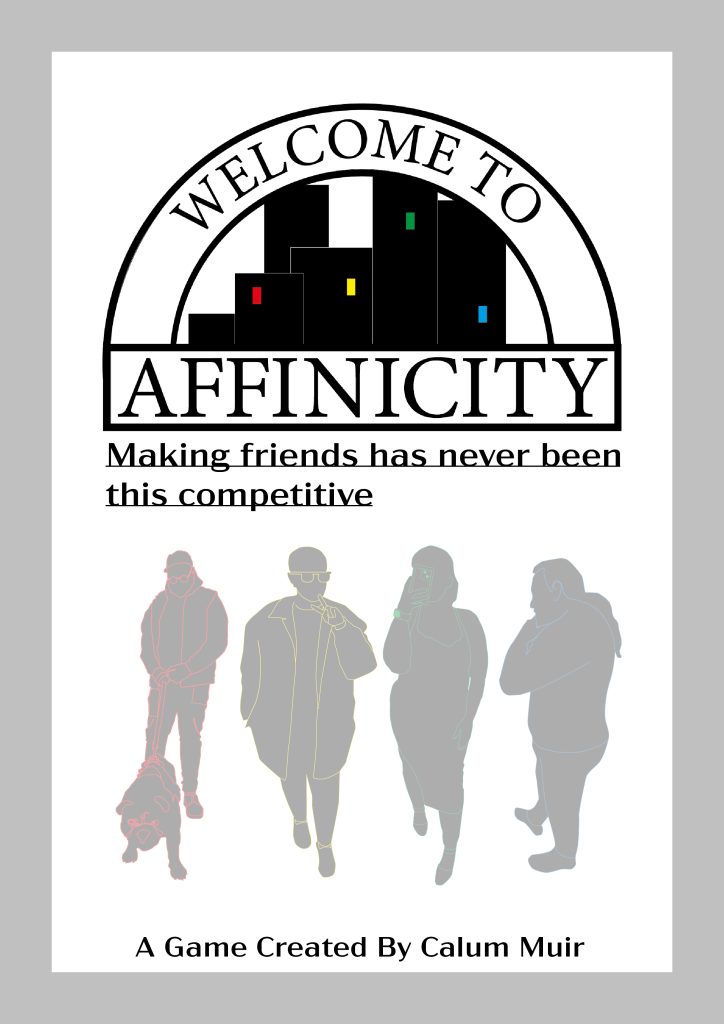
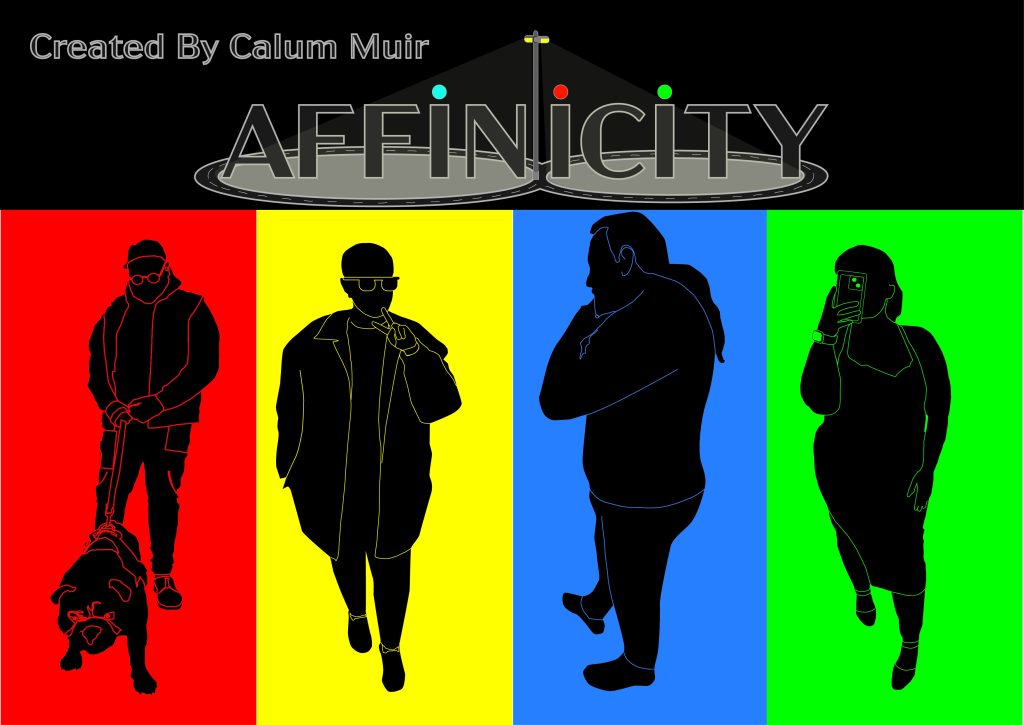
Here are three different cover designs, one was designed as the cover of the rulebook. The other two were designed as game box cover art. Discussing the first design, the rulebook design. The theme of the design came first. With the game being set within a fictional popular city what better way to express that than through a rulebook disguised as a travel guide. The imagery came before the typography, with the design and layout of this city backdrop, the composition came into use. Although this design visually is pleasing it does not follow the theme within the game too well. It works better as an independent design for a different project. The other two designs presented are closer to the theme of the game within. Both these cover designs were made to focus each of the logo designs; the first one was designed in a more traditional style and the second was approached with the intent to provide a more modern feel. Each design expands and rings focus to the characters from the game you would play as. The purpose being to convey as much information about the game as possible. A main note with board games as a subject, if you have not played the game or seen it be played there is no way to determine if it is actually a game for you. With limited space on a box you can only convey so much information to someone without them having to pay for it and find out after the fact. So cover art needs to be eye-catching and interesting enough to make somebody pick up the game in the first place. If the purpose is to make the game sellable then the audience becomes anyone interested in the hobby. That is what was taken into consideration with these final two designs. “Welcome to Affinicity” the cover was designed to match the logo, following the clean look of the white, it portrays its information clearly. With the addition of some filler sub text. The final design takes the minimalist approach and aims to use colour as the main focus of its design idea. There is a link in how these were both designed and they take inspiration from each other. The end goal was to achieve an aesthetically pleasing image that conveys some information to the consumer about the game itself. All three of these designs can be argued to achieve that.