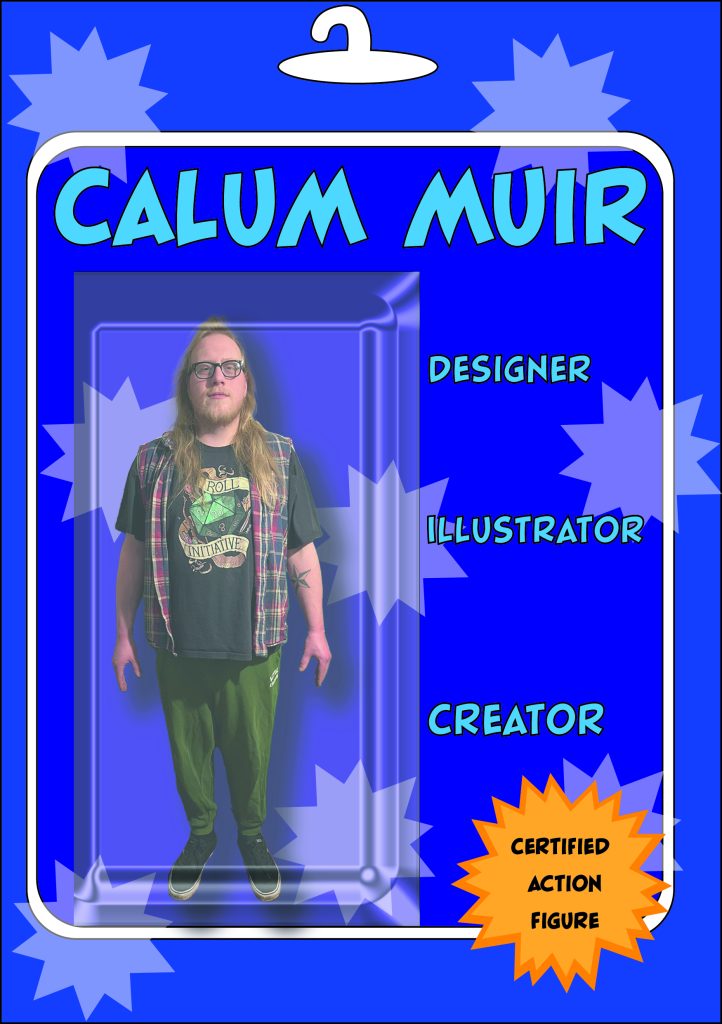
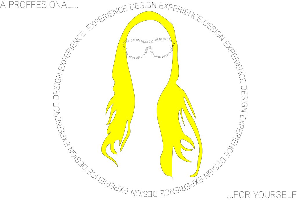
The purpose and intention of a self promotional poster is to show off who i am, what it is like inside my creative brain, and what type of designer i am. The first design is a familiar design. Placing myself into correlation with a product. I am showing that I want to sell myself to potential employers and future supporters. The message behind the design is a subconscious one placed within the image. The colour and style is designed to imitate a generic art style you could find within typical versions of real life products. Every aspect of this image was designed around the core idea of the action figure packaging. It also adds weight into the theme of design I intend to be pursuing. There is real intention behind the processes and ideas that have been designed. The second design option was chosen as a polar opposite to the previous. It focuses on typography and text over the imagery. A Minimalist approach to the symbolism of myself is there. A key fact about me is my long blonde hair, and black glasses, so they became a symbol for me to work with during this design process. Attention is brought to the text with a simple but effective use of wording a double meaning i provide two sentences to the viewer. “A professional design experience”, and “Experience Design for yourself.” The intent is to implant these messages within the viewer’s mind to enforce an established standard of myself with just a glance. The overall theme for the design was that of a business card, to me a representation and symbol of professional working.