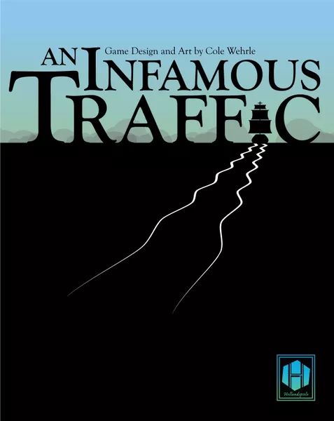
Conceptual design is a tool that, when used correctly can help to elevate content to a more complex level. It is in essence design that provides a concept or idea. Now applying this to board game covers and table top gaming in general, it became a first thought that this would be something designers would take into great consideration when creating board game covers, taking advantage of the limited space to creatively give the audience information into what the game is. Upon doing research into this it appears that didn’t seem to be the case. So I decided to provide and discuss one example of conceptual design that I think does it best in this medium. The first and main cover up for discussion is that of “An Infamous Traffic”. A game in which you play the roles of smugglers trying to fill the void the east India trading company had left during 1883 china. Instantly the eye is drawn to the games title, black lettering against a contrasting light background, we then notice that the I in Traffic has been replaced with a galleon style ship that has left ripples in the sea that fills the rest of the cover. Now initially it might be easy to think this is just a superficial use of conceptual design, however, breaking down the title of the game it could be argued that there was a lot more thought gone into this than at first glance. Infamous is used to describe someone or something that is well known for bad reasons or wrong reasons, most commonly used in reference to criminals (Britannica Encyclopaedia 1998). A more appropriate word here may be pirate, or smuggler. Next the word Traffic, in this context, the audience has the information that there is a naval theme, so traffic when used here can represent the traffic of trade ships, within that there is the theme and atmosphere of the game presented to the audience, two ideas have been combined and represented as something else. Being aware that this is not a conscious thing, more of a subtle indication. objectively it can be presented as a good example of conceptual design in this format.
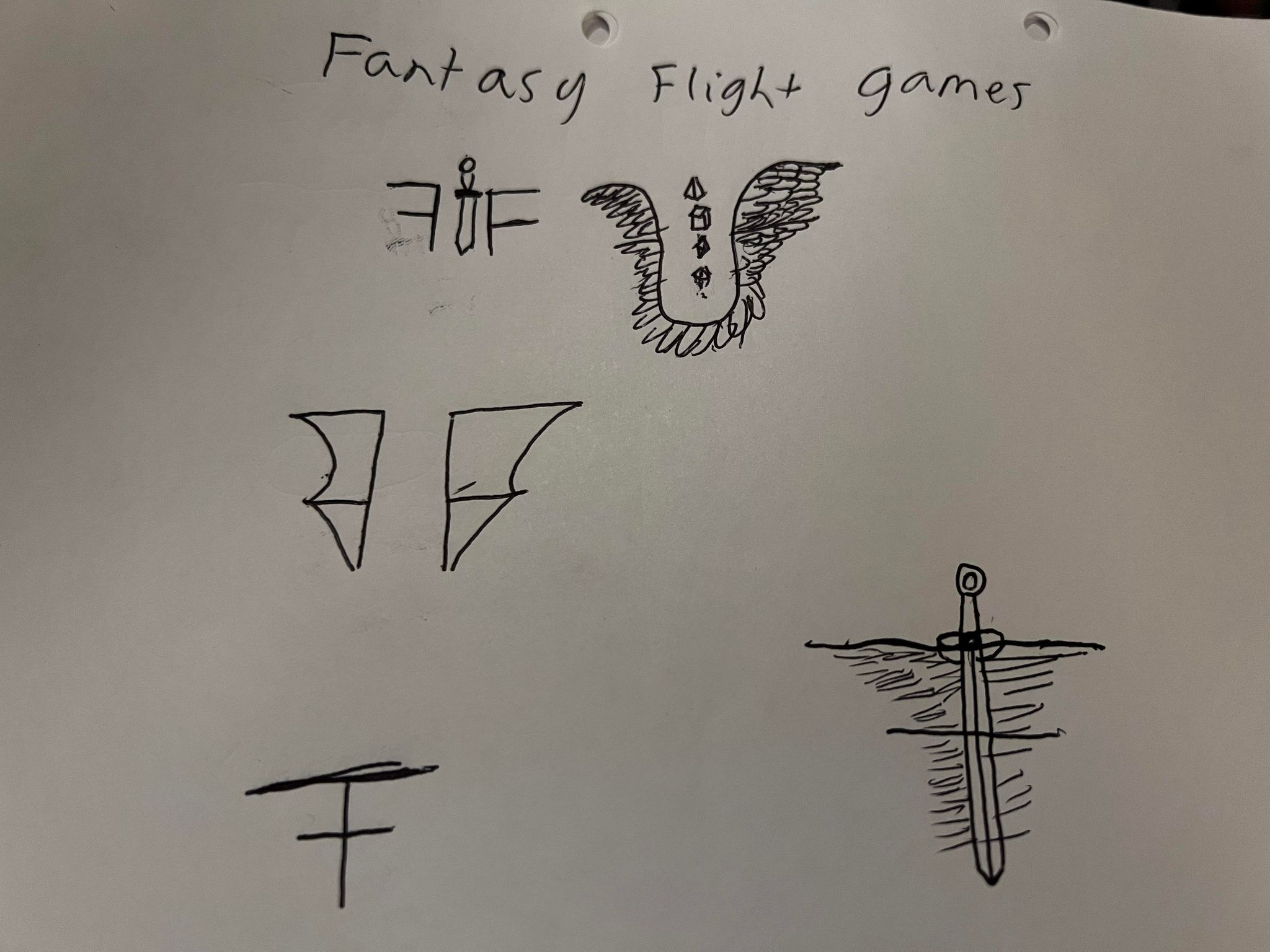
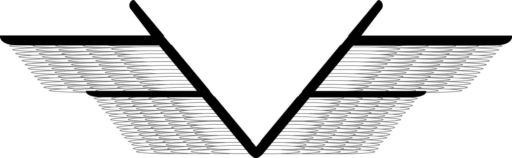
The subject for this redesign is the game publisher Fantasy Flight Games, the original log is presented for reference. Currently this design does not employ any conceptual design to it. In the revision process it was best to start by breaking down the words and understanding how they can be best represented. Each word itself provided enough information to work from, so to help with the decision making process the visual shape of the letters was analysed and taken into consideration. An uppercase F looks like an abstract half of a wing so then the design process took place through manipulating that shape and working out combinations of how it could appear more wing-like. Multiple variations appeared in the research process, revealing a potential dozen plus different ways to approach this. Should the wings be joined? What type of material should it be made to look like? All these important questions and others were pivotal in shaping how the refined version looks. Selecting the font was important, as it needed to have some embellishment and a prominent shape, to avoid being hidden by the feathers in the design. A thick sharp edged typeface was decided on purely for this assertive presence it gave. It was decided best to go with feathers for the wing detail due to the association with “good” beings; angel wings are often depicted as being white and feathery. This idea was subliminally intended to place that idea of good in association with the company title.
- Cole Wehrle (2016) An Infamous Traffic (Photograph) Available online https://boardgamegeek.com/image/3135977/infamous-traffic [Accessed 20/10/2022]
- Fantasy Flight Games (2022) Fantasy Flight Games (Masthead Logo) Available online https://www.fantasyflightgames.com/en/index/ [Accessed 01/11/2022]