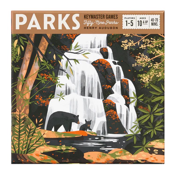
“Colour defines our world and our emotions” (Feisner 2006). It will be one of, if not the first thing you notice about a board game, and therefore it appears obvious that a good colour palette would be viable in producing a well received game. Within a board games design, it is believed good use of colour can make a game easier to use by incorporating important information into colour where possible (Teale 2015). With that in mind; taking a look at the board game “Parks” , a game themed around hiking through US national parks during different seasons of the year. This is a simple yet effective colour palette that has been chosen by the designers. Colour is generally at its best when used in moderation (Jaiswal 2014). On the Box cover for Parks, there are four main colours used; orange, green, brown, black, colours that all work well with each other and provide a distinct atmosphere when used together showing a good use of moderation within the use of colour. This is not a high pressure, intensive game; this is a game designed to be played in a casual environment with a calming atmosphere, which the colours do well at enforcing. It could also be argued that the use of these colours are similar to other palettes used for autumn themed design which could be a specific design choice intended to subconsciously place the idea of seasonal change into the consumers mind, a key concept of the game itself. One final point to note is that the colours seen here are then seen throughout the game itself which is important to acknowledge the psychological side to that, the designer wants the audience to feel familiar with the game even if it is their first time enjoying it. They help to achieve that by using the same colours presented on the box with the pieces within the games, which helps the audience to feel comfortable through familiarity and in doing so allows the game to become easier to use.
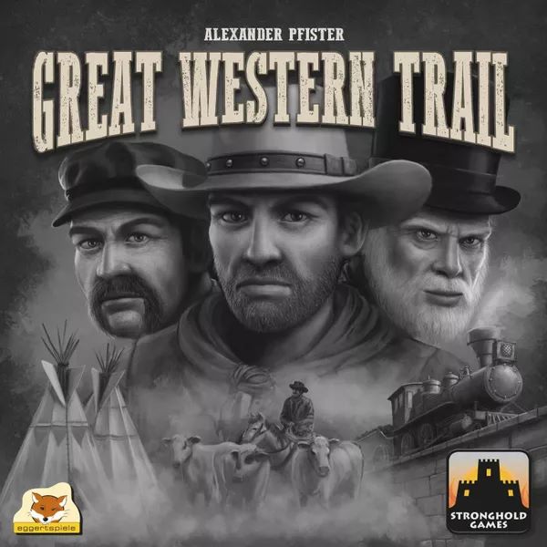
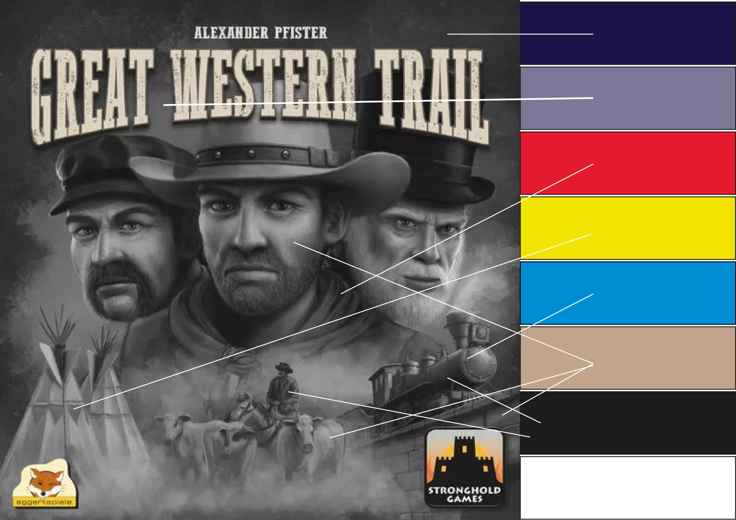
Upon searching for a bad example of colour in board games, it is evident that the majority of designers out there opt for an artistic approach when it comes to the design of board game covers. Although the term bad is subjective, during research, objectively there are a number of ineffective designs out there. However it is difficult to state that colour is employed ineffectively for a lot of the designs that have been approached in an artistic way. It became an argument in the previous post that colour can be used to make a game easier and provide subtle information. Through that thinking, the game “Great Western Trail” presents its box cover in a black and white format, the only colour being a slight yellowish tint on the title. The theme of the game becomes clear, it is obviously a game set in the wild west, but aside from that the colours offer no insight into what lies within. Quite contrastingly the design of the pieces and board within the box are full of bright and light colours, the complete opposite of what the dark shadowy colour of the box would lead the audience to believe. Following a revision of the colour palette, after taking inspiration from the analysis of the game parks earlier. There is a proposed change to the colour scheme, a combination of a tinted dark blue to provide a night time backdrop provides a more atmospheric feel fitting of the imagery of cowboys camping at night. A light brown similar to one found within the game’s interior in combination with different tints can provide enough versatility to cover the range of colour from the characters skin tones, the bridge, and the cattle. The colours red, yellow, and blue are used in the game to represent the three player colours available. Using these in a way to highlight and add detail within the design could increase the quality of the design. It can also be used to highlight significant aspects of the game through the artwork design. The designer intentionally included this imagery onto the art, but it remains lost within the bland greyscale colouring of its original design. Finally simple use of black and white to add detail in shadows and highlights where needed.
- Feisner, E. A. (2006). Colour: How to Use Colour in Art and Design. United Kingdom: Laurence King.
- Keymaster Games (2019) Parks Keymaster Games (Photograph) Available Online https://keymastergames.com/products/parks [Accessed 01/10/2022]
- Martin, W E. (2019) Great Western Trail Eggerspiele, Stronghold Games (Photograph) Board Game Geek Available Online https://boardgamegeek.com/image/4887376/great-western-trail [Accessed 28/10/2022]
- Shrivastva, K. & Jaiswal, A. 2014, USAGE (IMPORTANCE) OF COLOUR IN GRAPHIC DESIGN, International journal of research – granthaalayah, vol. 2, no. 3SE, pp. 1-3.
- Teale (2015) Graphic design in tabletop games. Available Online http://nothingsacredgames.com/graphic-design-in-tabletop-games/ [Accessed 28/10/2022]