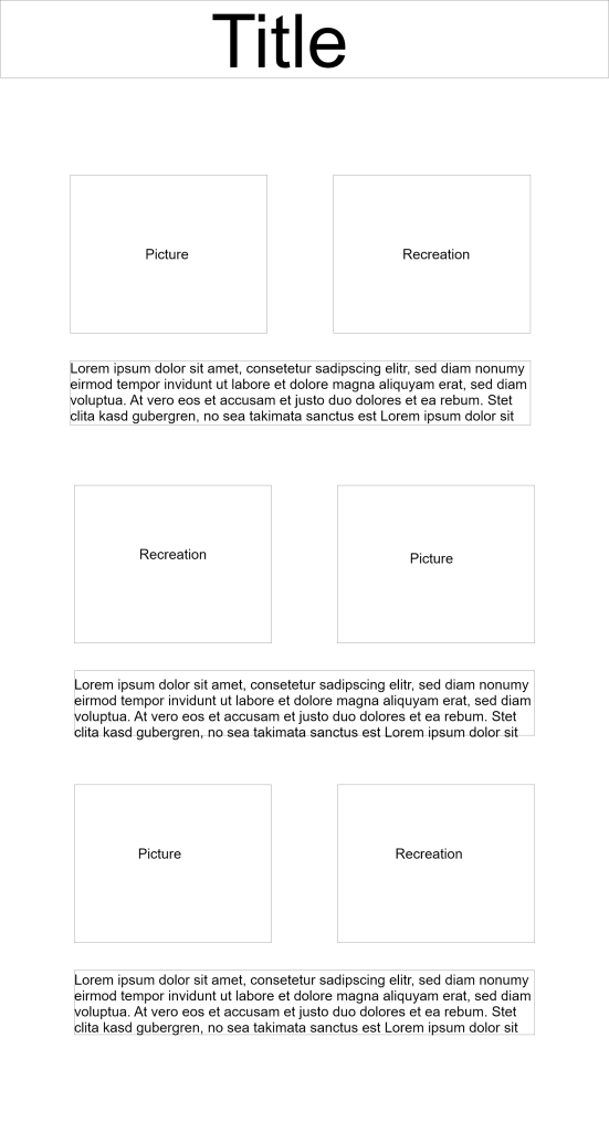
To begin forming an idea of how the webpage will look we must build a prototype of how we would like it to work to help visualise what needs to come next.

Here is a very basic low fidelity prototype, outlining a very basic view of how the flow of the webpage will look gives us an idea of what we can begin to improve on and any issues that may come about. in this iteration i thought an interesting quirk would be by having the placement of the original image and recreation alternate through every post. the realisation of this makes it seem unnecessary and could be achieved in a much more beneficial way.
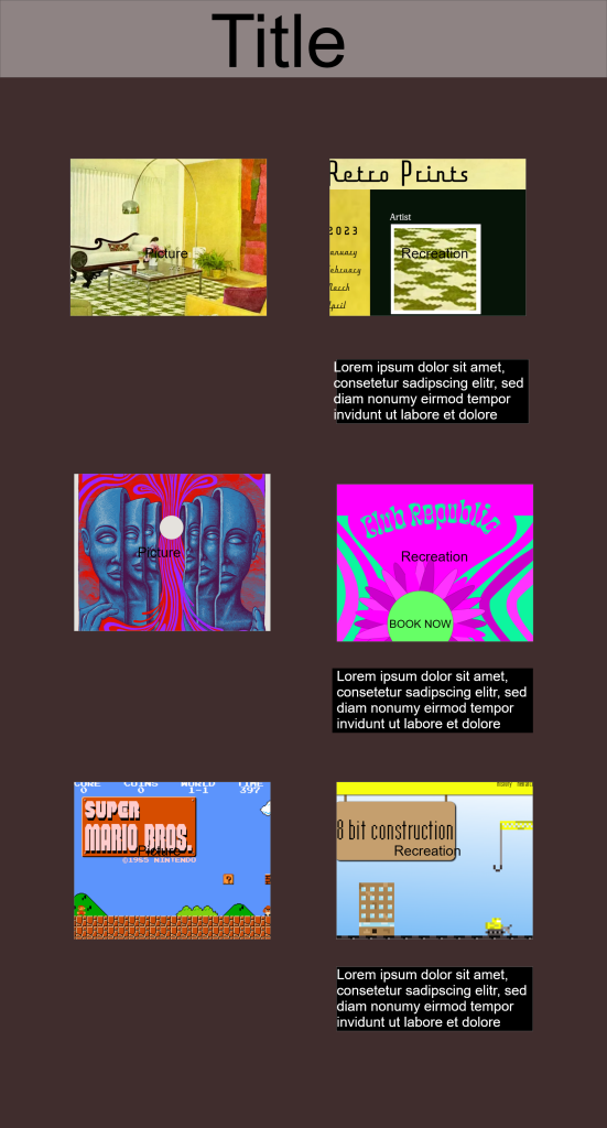
after visualising the low fidelity and acknowledging design flaws, there comes the logical step to move onto a more in depth prototype

Although the addition of colour and some elements can help with the visualisation. it helps to point out what does not work. in this part we tried addressing the issue with composition placement. with this iteration there is a slight improvement to the overall visual of the webpage, the colours need addressing as the light text on dark background can work but these choices of colours do not seem to add anything to the webpage.