Web and app design allows a person to be able to challenge their way of thinking, it gives the tools and the opportunity to invent and reimagine. A designer wants the user to visit or use the app or webpage they have designed, they want the user to be engaged and come away with all the relevant and correct information that needs to be stated. Web and app design’s role in this is that of a toolkit and canvas that allows the author to create meaningful and memorable experiences that can outreach the physical realms of traditional paper. A prime example of this is the interactivity capabilities that are offered within app and web design, a research study done in 2003 titled “An empirical study of the effects of interactivity on web user attitude” (Teo, Oh, et al) found a positive link within User Interface (UI) activity and the user. An aspect of consideration for every designer with web design is how the user will handle navigation, and interactivity. This user experience is something that can be fully explored and reinvented through web and app design. Its role can be defined as ingenuity and accessibility, it allows infinite access and possibilities within the scope of the designer, According to the House of commons Research Library research briefing “Uk disability statistics: Prevalence and life experiences (Wade 2023), during the 2021/2022 it reports thats 24% of the population within the United Kingdom (UK) had a disability. In today’s modern society technology continues to advance, and with that offers a potential to be able to apply conscious design in acknowledgement of those that can face difficulty in standard practices. “Inclusive design means making your product available to as many users as possible” (Gilbert 2019)
The Impact of App and Web Design
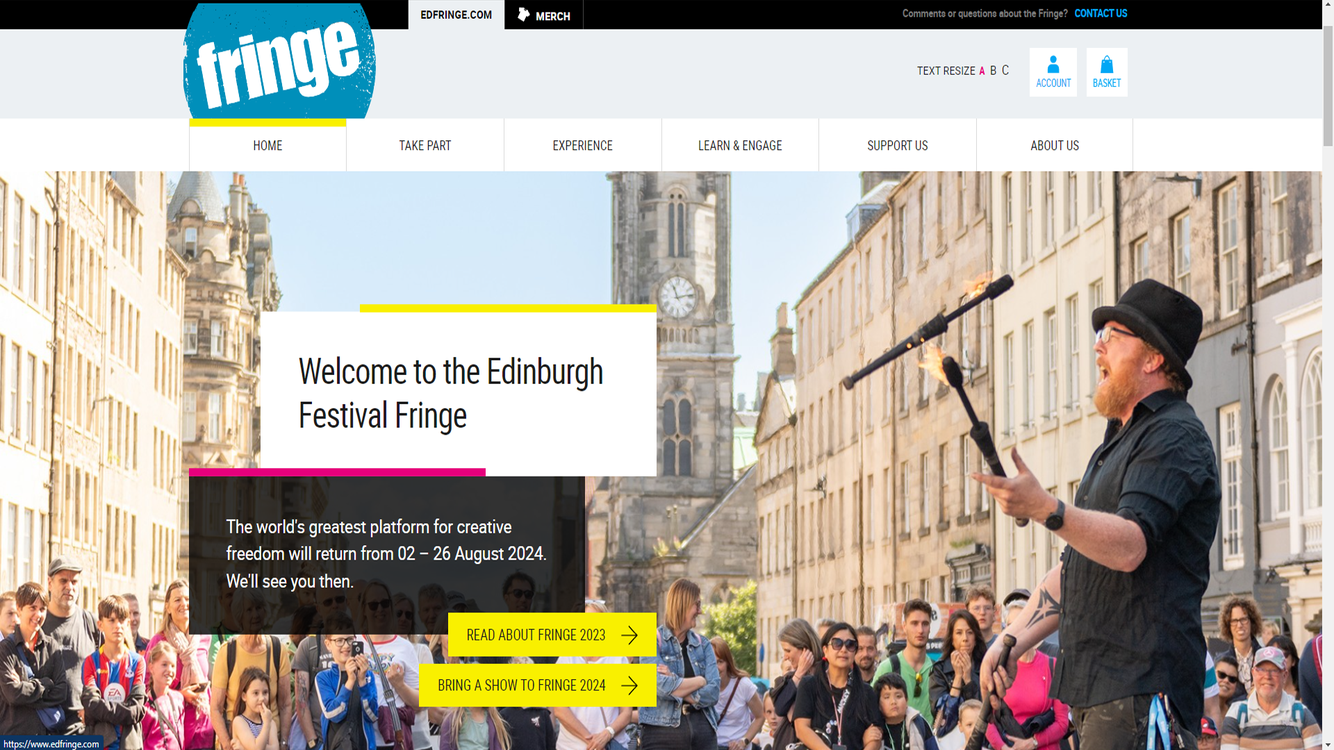
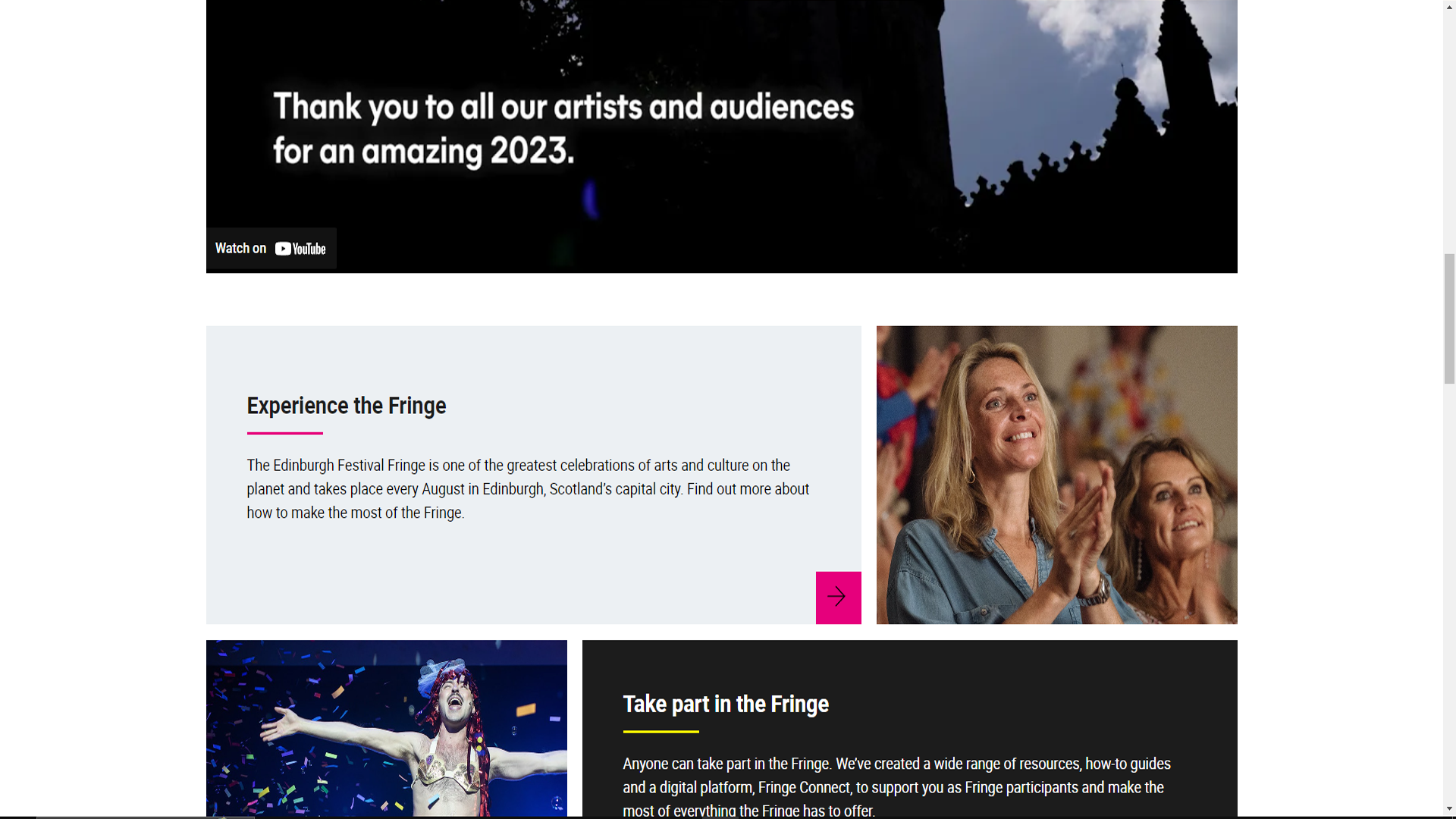
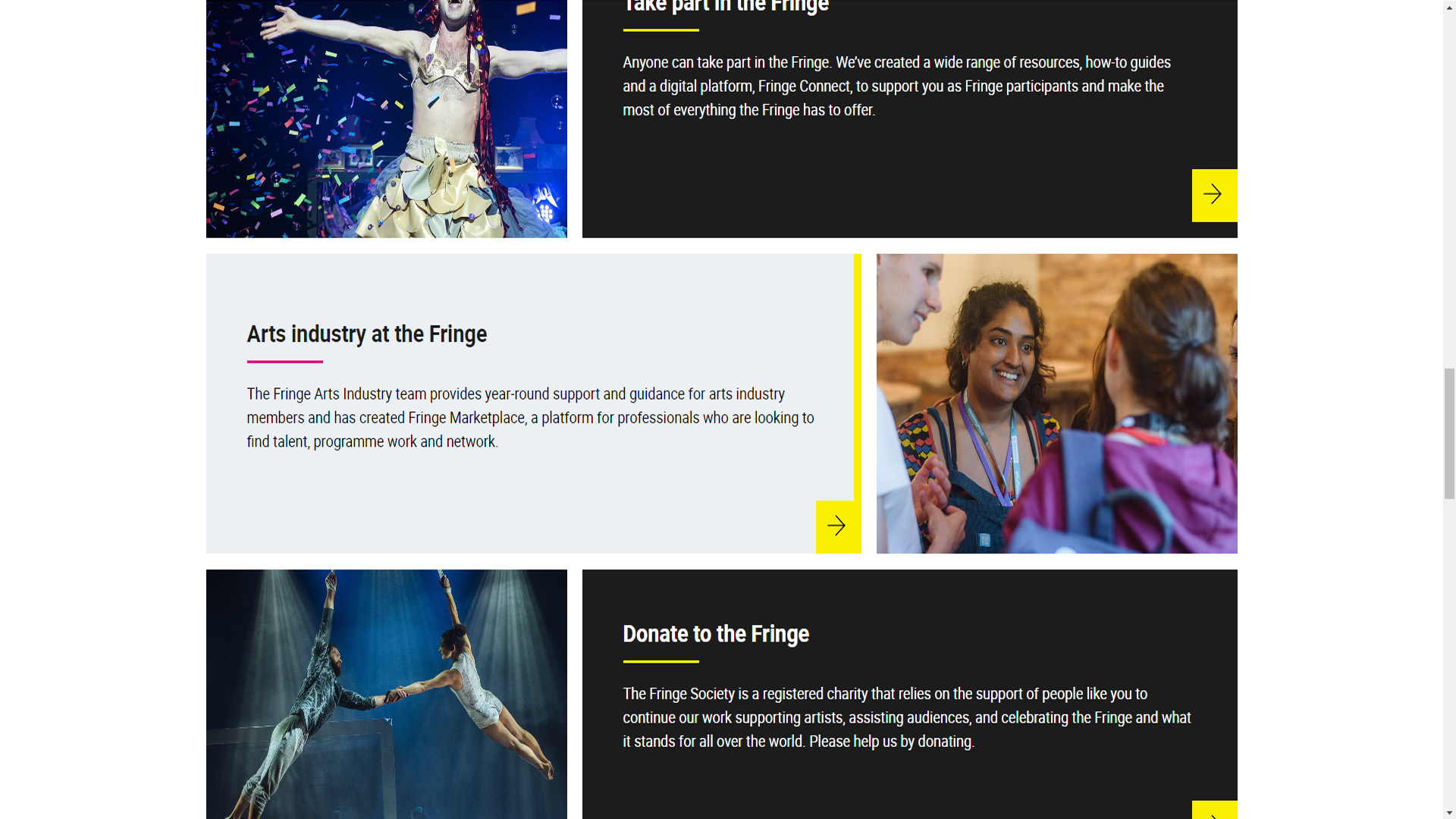
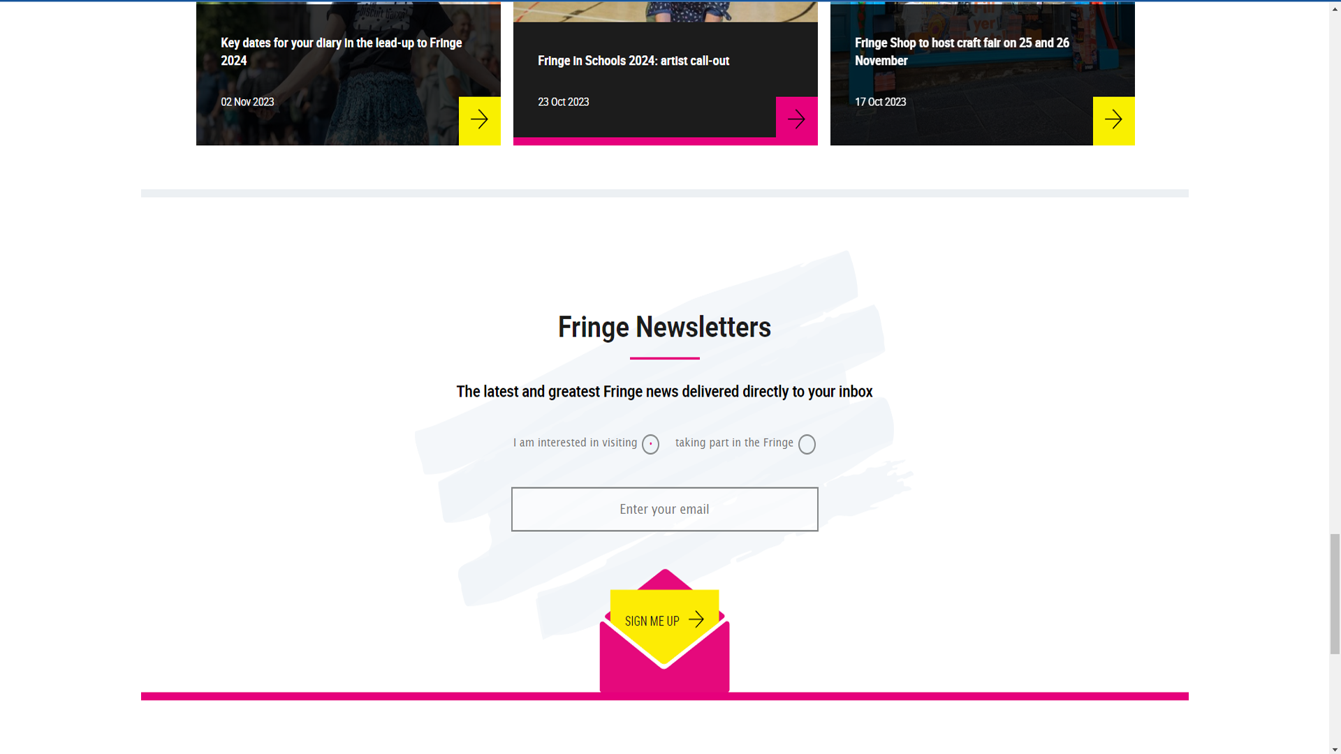
The Edinburgh Fringe Festival is a cultural event hosted in the namesake city, self described as the world’s greatest platform for creative freedom. It features a prominent marketing strategy across a multi channel experience. A feature webpage that follows a professional layout and structured use of grid designs, its approach follows a general theme within these event promotions, less is more, the idea seems to imply much of letting the action do the talking, in combination there are obvious sights of accessibility features available upon immediate arrival. A conscious effort being applied into accessibility, in combination the event features a mobile app available to download, that users can interface with.
Edinburgh Fringe Festival webpage 1/4
Edinburgh Fringe Festival webpage 2/4
Edinburgh Fringe Festival webpage 3/4
Edinburgh Fringe Festival webpage 4/4
Across all these formats and channels the brand identity remains clear and concise, following its own individuality and themes. The use of oceanography and typography work well to provide a clear structure and hierarchy to the content itself, with the webpage offering appropriate calls to action within the composition of each page. This atmosphere has a minor professional feel to it, however it seems to approach itself in an informative and youthful manner through its bright colour usage against the hard white background. The Strategy with this event is one of Ease of use and accessibility, it does not focus on fantastical user experiences, or technical interfaces. It requires the audience to be able to access and use the information in as user friendly a way as it can provide.
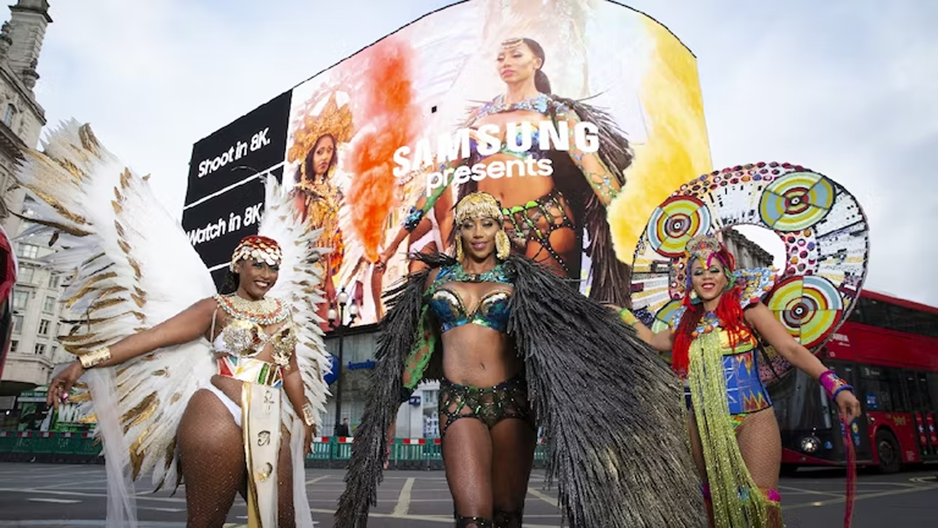
Digital design can help enhance campaigns for cultural events by utilising visual extremes to deliver a memorable experience to a consumer. During the year 2020 there was the Covid 19 global pandemic which resulted in mass “lockdowns’ ‘ within countries, forcing people to stay home, this caused issues within certain industries that would lead them to be unable to continue with every day work. A particular example of this would be the events industry, as people were unable to attend public places en masse, companies and organisers needed to find a way to adapt or lose out. A multi channel marketing strategy utilised by Samsung allowed one event to prosper in an otherwise dire time. Samsung assisted Notting Hill Carnival with an online presentation that delivered this experience to the public at home. Partnered with Taylor Herring a digital campaign featuring film series’ launched onto social media, a digital trailer to feature on the Piccadilly Circus digital screen, and a live countdown to “drum up hype” (Marketing Week N.D). A goal that would only succeed with an effective use of digital and web design used in its campaign, this begins to show the benefits of its utilisation within these campaigns.This use of a multi channel marketing strategy led to the effectiveness of the overall event.
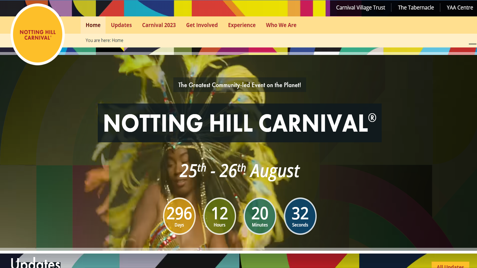
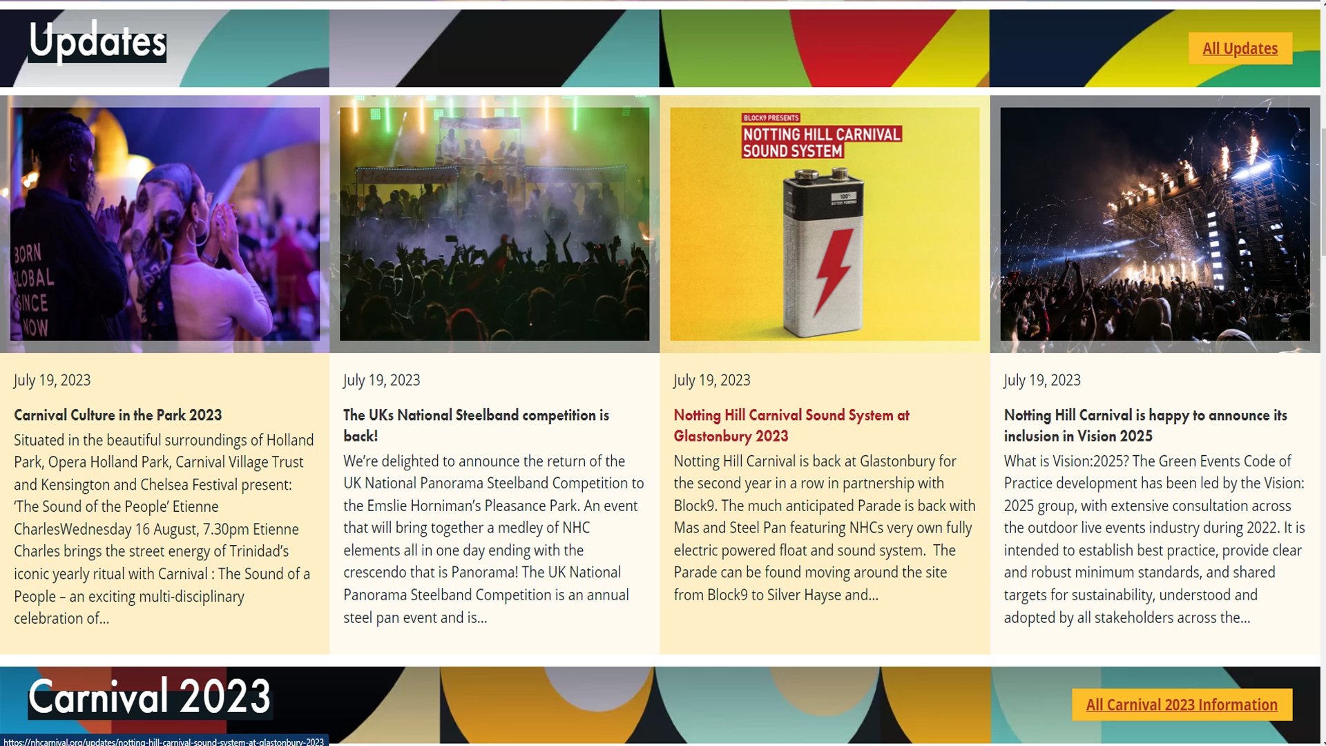
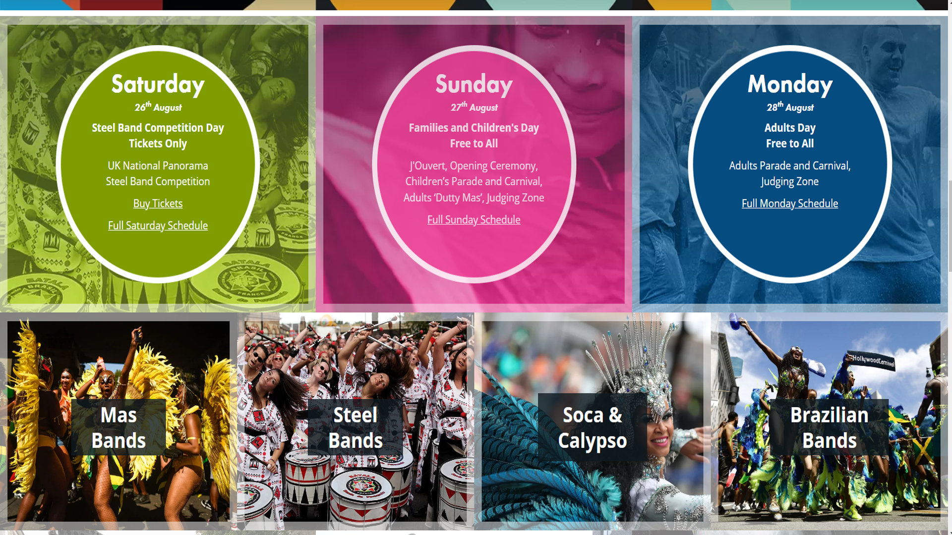
Here is the current website of the Notting Hill carnival. At first glance there is a prominent hero image, or video in this instance, showing a detailed first glimpse into this brand and what it offers. The website overall follows a very obvious grid structure that separates and identifies relevant information in a clear way for the user. It is accompanied by a thorough theme in the colour palette that matches the aesthetic and feel of the event. The grid structure allows for an easy modular design that adapts to different formats well; different sized browsers, and mobile view. This gives a fluidity in its presentation that allows a friendly experience for the user. By utilising this grid it offers a clear hierarchy that is easy to understand and navigate. Using a well designed grid system helps create symmetry in the design and layout of the webpage, through creating an easy to navigate interface, there is less strenuous thought needed from the user.
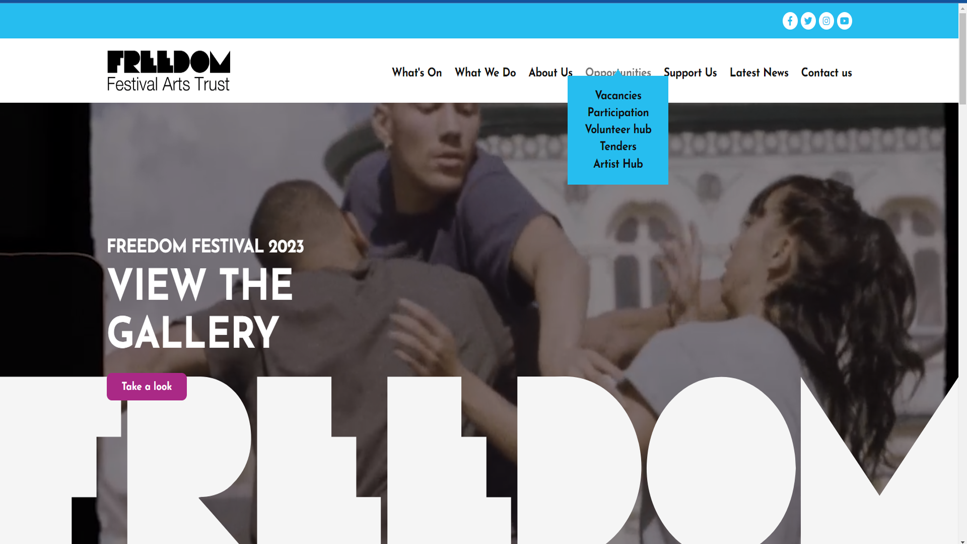
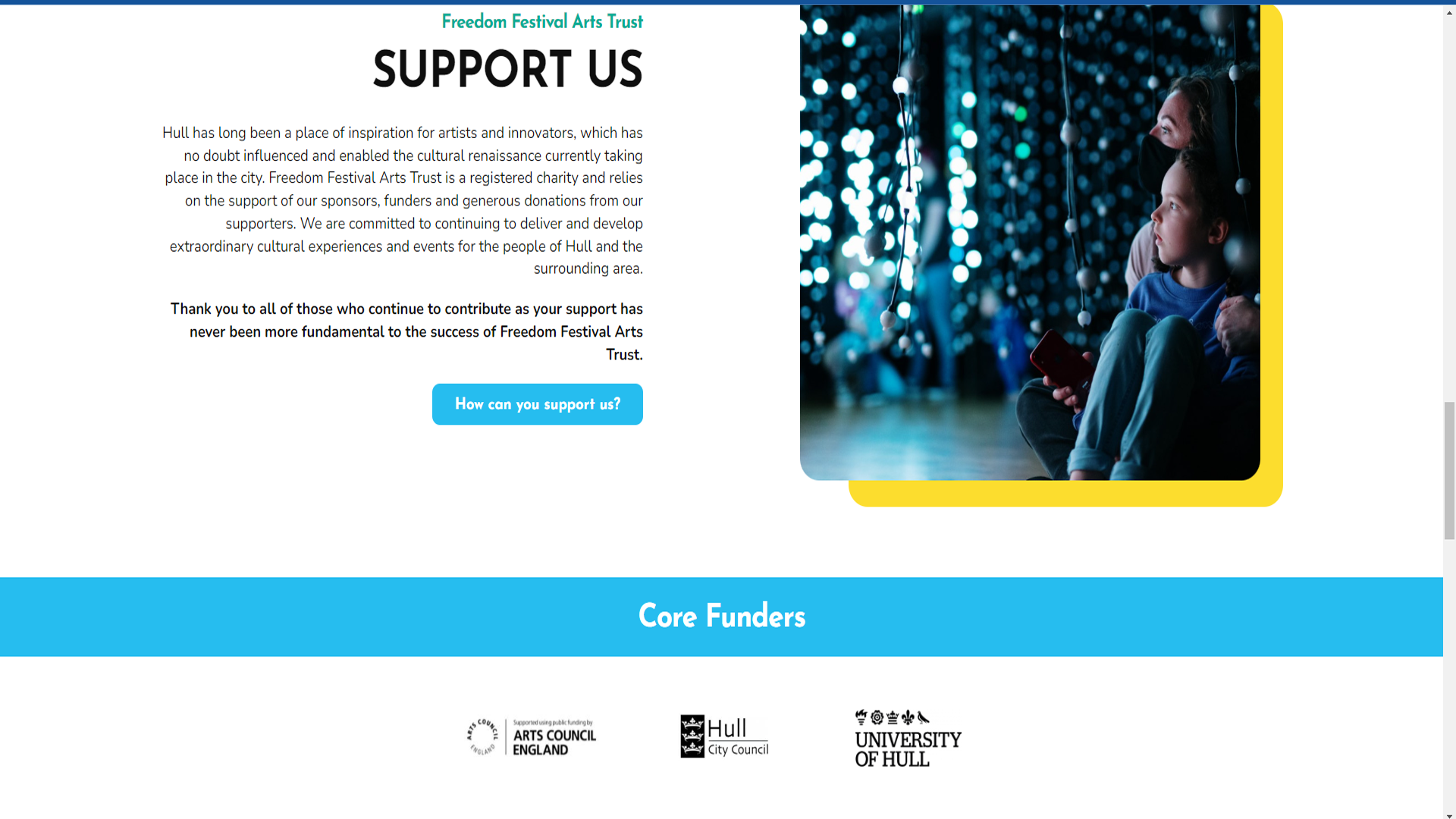
Looking at the current Freedom Festival webpage there has been a similar approach taken. There is a navigation banner at the top with a clear structure to its priority, the hero image claims most of the space with a placed call of action inviting the user to take a look, scrolling down there is a more spacious layout, within the content. It allows the user to have more freedom to explore the page itself, rather than guiding the user in a specific way. This fits in with the approach in the colour palette: the logo for Freedom Festival contains an assortment of colours that are matched in the accents within the webpage. This layout and structure works well in the responsive design of the webpage, allowing it to be easily read and accessible in multiple formats, with a key design point needing to be consistent. In comparison to the Notting Hill Carnival design there could be an argument that the current webpage of the Freedom Festival lacks a feeling of personality.
The overall look and feel of the webpage should match the “attitude” of your business and its objectives (Kara Jensen 2013). An interpretation of this within the relevancy of this subject would be the comparison within these two separate events. Both are slightly different takes on cultural festivals but close enough within their motives to offer a reasonable analysis. Notting Hill Carnival matches its energy through its web design and presentation, emphasising the boldness and brightness of its performances with a strong use of suitable colours and layout of its content. In contrast the Freedom Festival webpage has a more formal presentation in itself, it justifies its composition well with a clean visual, but a new approach emphasising its personality could benefit the subject greatly
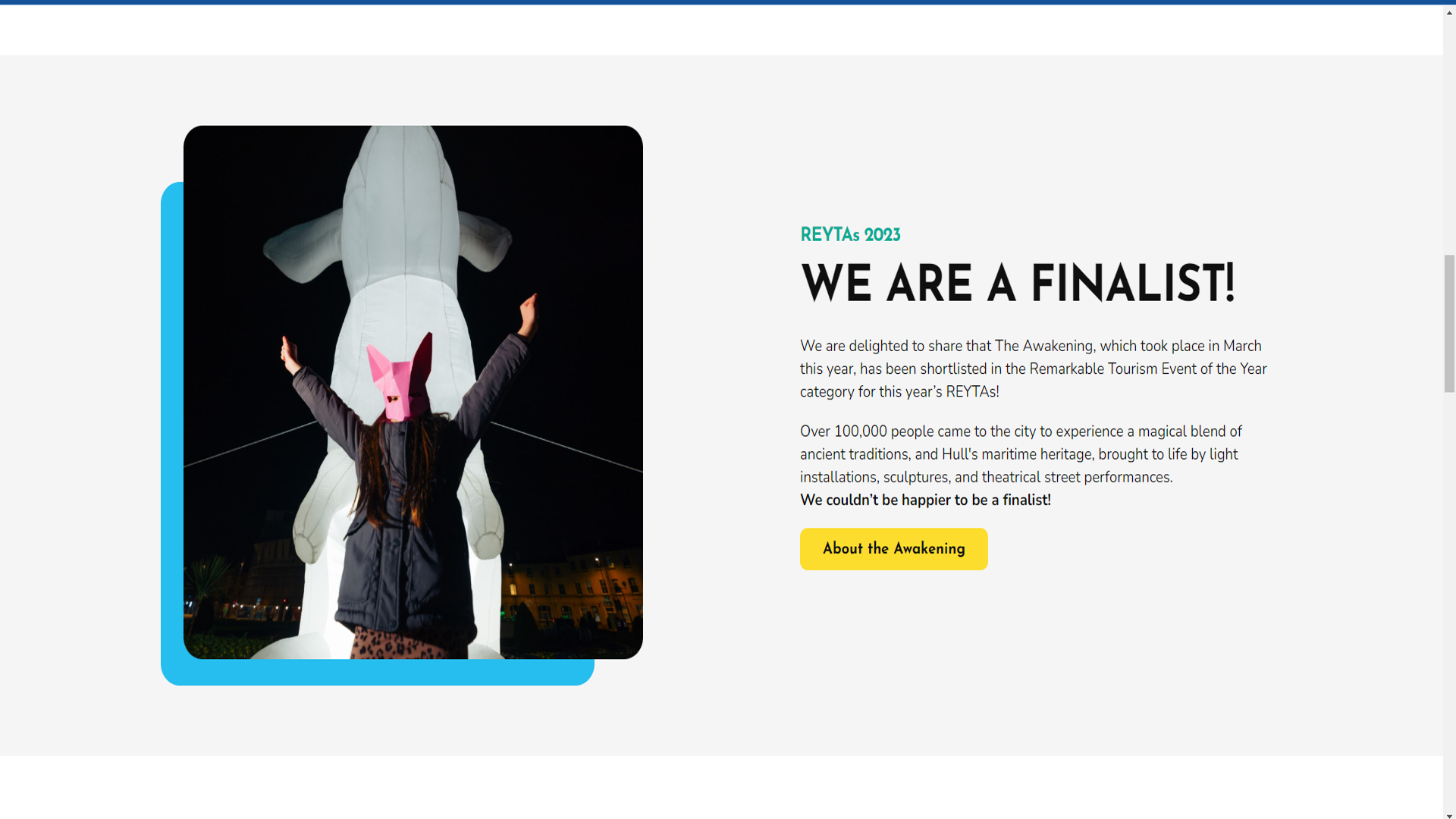
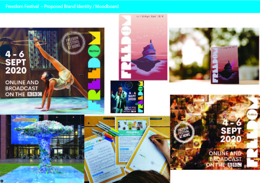
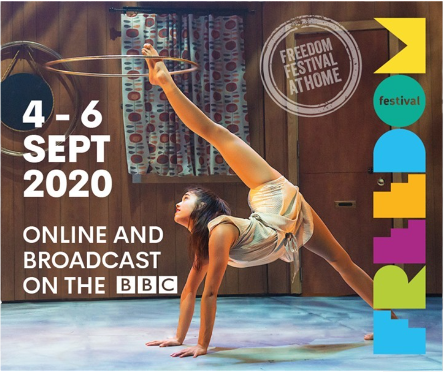
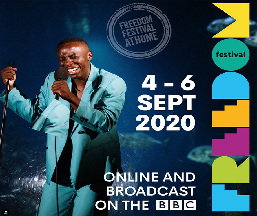
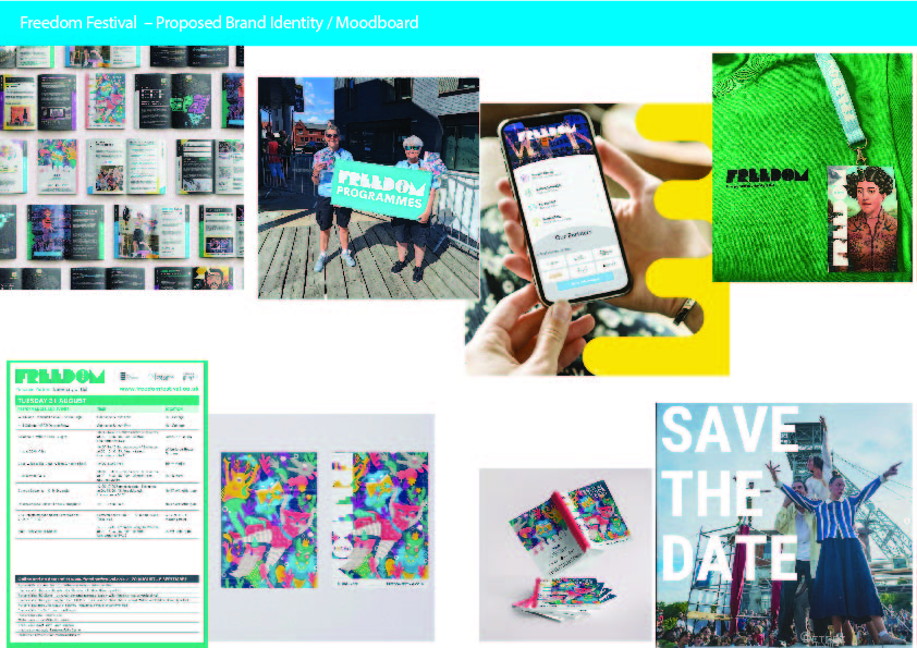
During this segment there will be a focus on the different visual campaigns over the last few years from the Freedom Festival, using accessible images from the various social media archives available. In 2020 the Freedom festival was also hindered by the pandemic and as such decided to capitalise on a marketing strategy of “Freedom Festival at home”. This strategy had a series of promotional image posters launched on different platforms to advertise and market itself. Through search and analysis, there became a clear theme of “You” as in the consumer, or attendee of the festival. “What does the Freedom Festival mean to you?” was a question commonly adorning instagram posts followed by images like these.
In these images there is generally a singular subject as the main focus, accompanied by the standard logo as its brand identifier, all these posts follow a similar style within the layout, that helps to emphasise and encourage this theme of “You and your Freedom Festival”. This extends to the print material as well, the illustration on the programme also features a solitary figure standing on a rock as the main focus. What also becomes clear is this friendly tone of voice that along with a brighter colour scheme becoming a key piece of the strategy allows an accessibility and access to everyone, it tells the consumers that this is an event that anybody can have access to; bringing a highlight onto the importance of “you”.
In 2022 there is this feeling of personality and character that appears to be brought to the approach of the graphic material. It is during this year that a new theme seems to have taken hold, the focus on togetherness, and “we” as a group starts to come through. The programme features an illustration of a group of brightly coloured characters that tighten in that theme, the images posted on social media feature groups or multiple people, emphasising the event portion of the festival. The organisers this year want you to be excited, they want you to get your friends or your family and go and have a celebration. This is shown through this imagery and language displayed in this content.
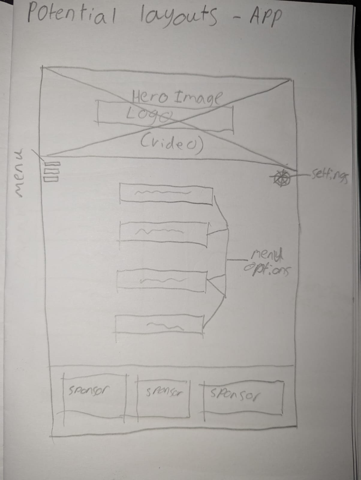
Bringing that focus back to the Freedom Festival being an event for everyone the concept art of an app design shows a more modern adaption to the marketing, capitalising on the advertising space within nearly every person’s pocket, an app is an ideal strategy to take advantage of within a brand redesign.
This current years approach follows on and hones in on that personality that began being developed in 2022, there is the recurring cast of characters situated on the programmes, an emphasis on themes of “us, we, our” it carries on that unifying message it seems to be establishing. The established typography, and iconography is becoming unified in its branding and advertising. At this point in time there is no thoroughly unified system, there are a lot of good ideas working separately from each other, it could be seen the focus was put into the overall atmosphere of the event. These recurring ideas that have been shown are a good step to increasing the recognition of the brand itself, and combined with this personalisation of removing the mask of those behind the event as well. The view is to form a personal relationship with the audience, to break down the walls of separation and link back into this theme of unification.
Rebrand Outline
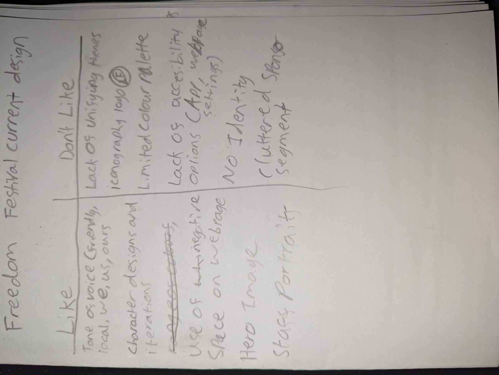
Upon gathering this research across the Freedom Festival, there is a clear view of a lack of unifying brand identity. The logo icon arguably barely follows the theme of the full logo design, its identity with its webpage does not match the individual content it shows throughout each year. There is a platform that works well as an individual but fails to match in the overarching scheme of the brand.
As a result of all this research, a redesign of the Freedom Fest brand should have a focus on identifying and establishing the brand identity, to do so a fresh look a the individual content is needed, a list was made of different parts that were liked and not liked from the current selection of content available in this research blog. Using this list gives a direction to begin in approaching the redesign. Another focus of importance is the aspect of accessibility, by acknowledging the previous themes of earlier Freedom Festivals there is a clear indication of community and togetherness, or to the very least that is what the intended goal appears to be, to capitalise on this a multi channel approach will be needed and so it is within reason an app should be made available as part of this project to deliver a true user friendly experience.
To outline the new intention for the redesign I would take a fresh approach by utilising a new redesign of the webpage that currently exists recreating it following a grid format as already is but having a main intention of giving it a full identifiable personality, to do this I would take the idea of the characters from previous programmes and apply that to a mascot style format for the redesign. In the spirit of community I would suggest having something that could be either redesigned or reimagined each year as in the spirit of community it could be reasoned as a good idea to feature a different artist or designer each subsequent year to collaborate and have their own version of this mascot/logo which could be incorporated into that years theme.
To continue in the process, there would be a redesign of the social media logo that is used, that would represent something more in the spirit of this desired brand identity, the colour scheme that is currently in use within the full logo is not unappealing, however i feel it could benefit from being allowed to have more flexibility within itself. To that it can be suggested that as with the mascot idea, the full logo and icon logo would adjust depending on the featured collaboration of that year. Outside of digital content, to amplify the multi channel aspect there will be a full design of posters and banners to feature within the city, that can be placed in local shops, on buses and other advantageous advertisement locations.
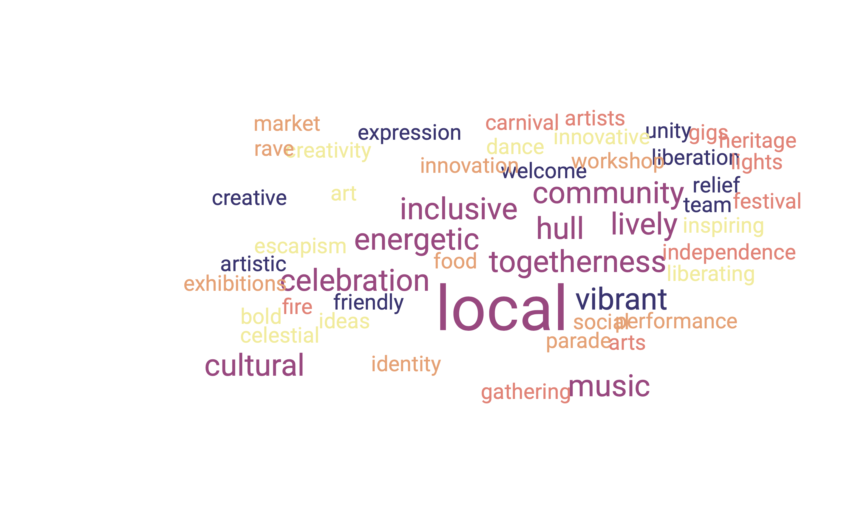
To gain an idea of this redesign as a whole, a theme choice would be a good starting point to lead inspiration into the finer points of the design. During a wordcloud session of the discussion of Freedom Festival, this is what was produced:
An appropriate choice of words for this particular event and an array of inspiration to choose from. Settling on the word “community” feels like a fitting piece for a theme for a cultural event like this.
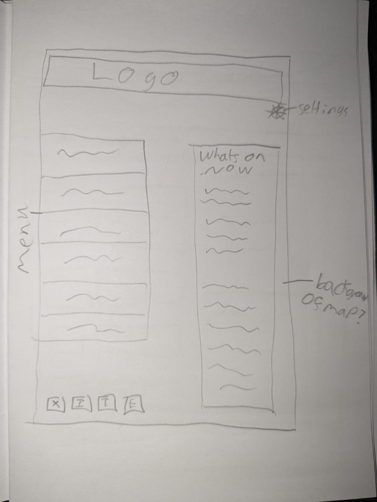
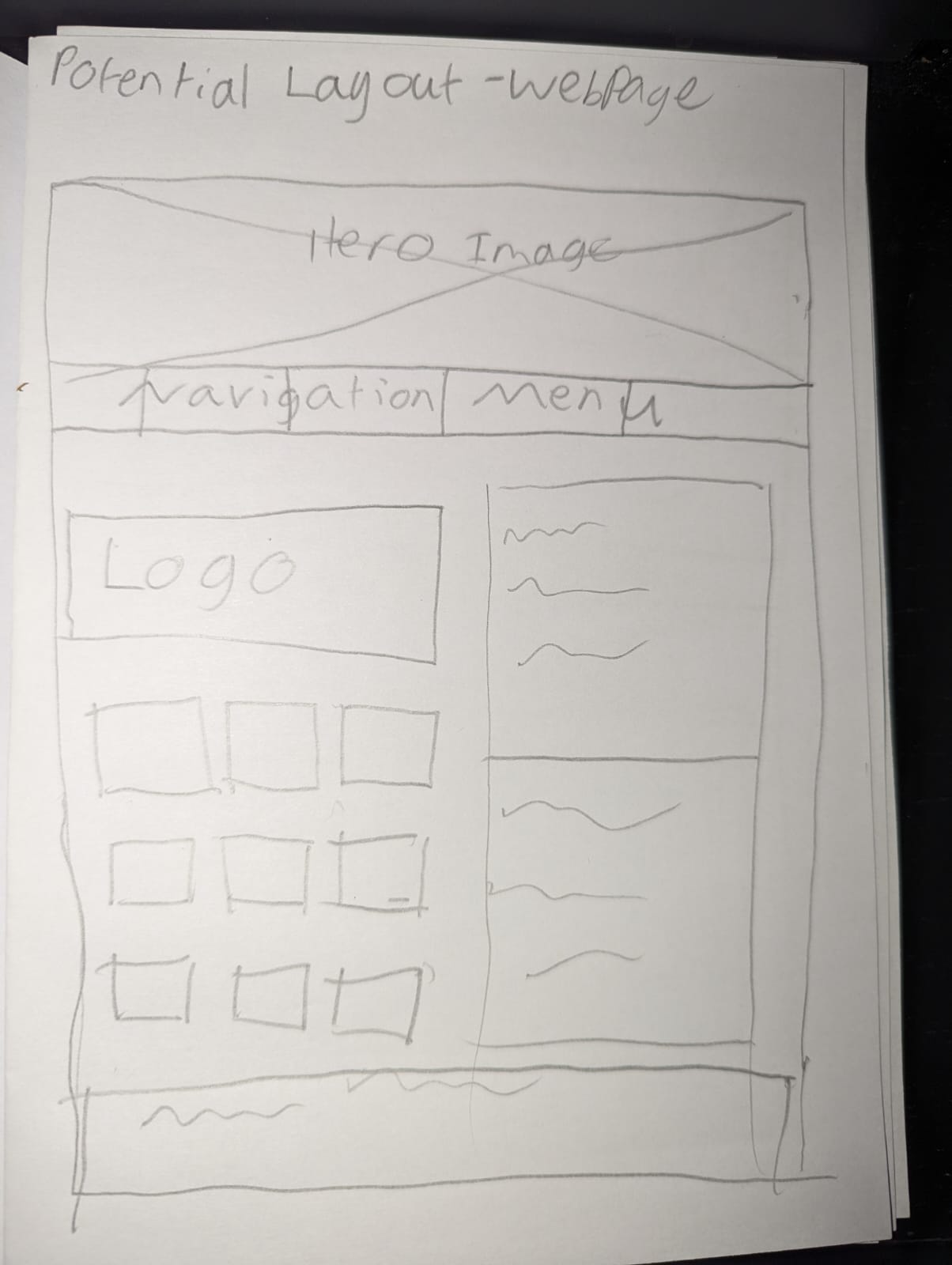
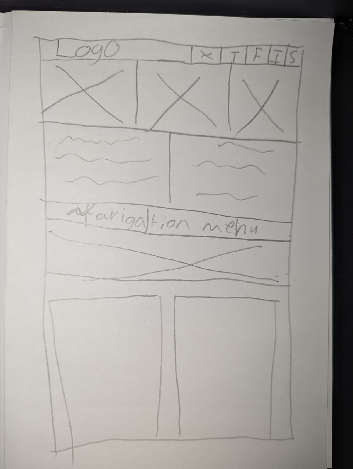
Finally as part of the redesign of the webpage I have come up with a few concept drawings of potential layouts. I tried to incorporate different aspects of what was on the liked section of the list earlier, and the hero image is a feature that would pop up frequently, alongside this are mock up designs for potential landing pages for an app to help accompany the festival in the future. During the full process there will be a highlighted focus on the user experience, and unification of the brand identity. To summarise the key points of interest in this redesign; A brand new unifying identity featuring a logo redesign and matching layouts and visual profile across different social media applications. A new personality injection through an identifying creation of a mascot profile. Designing of an app that follows the theme and identity set out through brand redesign, and a campaign of poster designs to feature throughout the city.
References
Edinburgh Fringe Festival 2023 Screenshot acquired online https://www.edfringe.com/ [Accessed 01/11/2023]
Freedom Festival 2023 Photo acquired from Instagram “freedomfesthull” Available Online https://www.instagram.com/freedomfesthull/?hl=en [Accessed 02/11/2023]
Freedom Festival 2023 Screenshot acquired online https://www.freedomfestival.co.uk/ [Accessed 02/11/2023]
Gilbert, R.M., 2019. Inclusive design for a digital world: Designing with accessibility in mind. Apress.
Kara Jensen. 2013. What is the “Look and Feel” of a Website? And Why It’s Important. Available Online https://www.bopdesign.com/bop-blog/2013/11/what-is-the-look-and-feel-of-a-website-and-why-its-important/. [Accessed Online 01/11/2023]
Kirk-Wade, E. 2023 UK Disability Statistics: “Prevalence and Live Experinences” Research Briefing House of Commons Library
Marketing Week. N.D “How Samsung brought the Notting Hill carnival to life online” Available Online https://www.marketingweek.com/masters-awards-samsung-notting-hill-carnival/ [Accessed 03/11/2023]
Teo, H.H., Oh, L.B., Liu, C. and Wei, K.K., 2003. An empirical study of the effects of interactivity on web user attitude. International journal of human-computer studies, 58(3), pp.281-305.
Notting Hill Carnival 2023 Screenshot acquired online https://nhcarnival.org/ [Accessed 02/11/2023]