Development Log
Introduction
Composition, Typography, and Colour
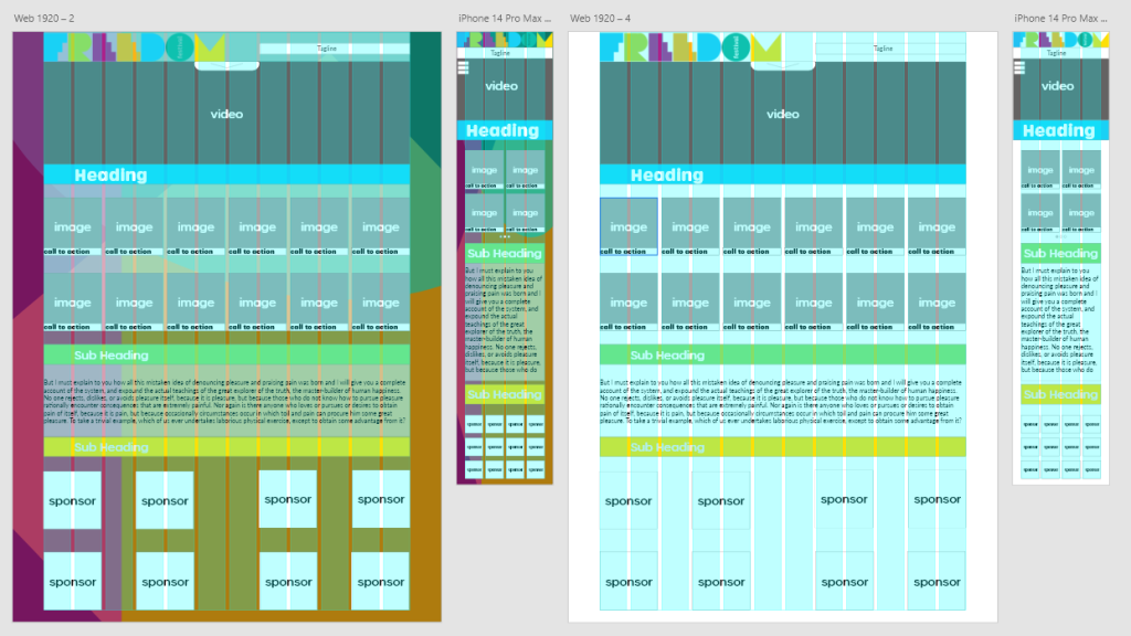
The development of this project begins with the conceptual design of the website which involves discovering the desired composition, typography, and colour schemes. During this process, initial sketched designs were drawn. A number of prototypes and ideas were drawn up and collected before discerning which ones appealed the most, once narrowed down after a comparative analysis with the research undergone earlier in the assignment, a final layout choice was reached. The decision behind this was in favour of a structure focused on what would provide the audience with the most important information the company: “Freedom Festival” wants to display; the what, and why. What is the Freedom Festival, and why should you, the audience, want to go? The focus of the Hero image (video) in this design is the main tool in delivering this information, followed by a heading and gallery of images, this is where the viewer would immediately see what is available. A section containing all the featured acts and performances, galleries, and shows available.The information laid out within this design is displayed in a distinct hierarchy to convey the importance of it.
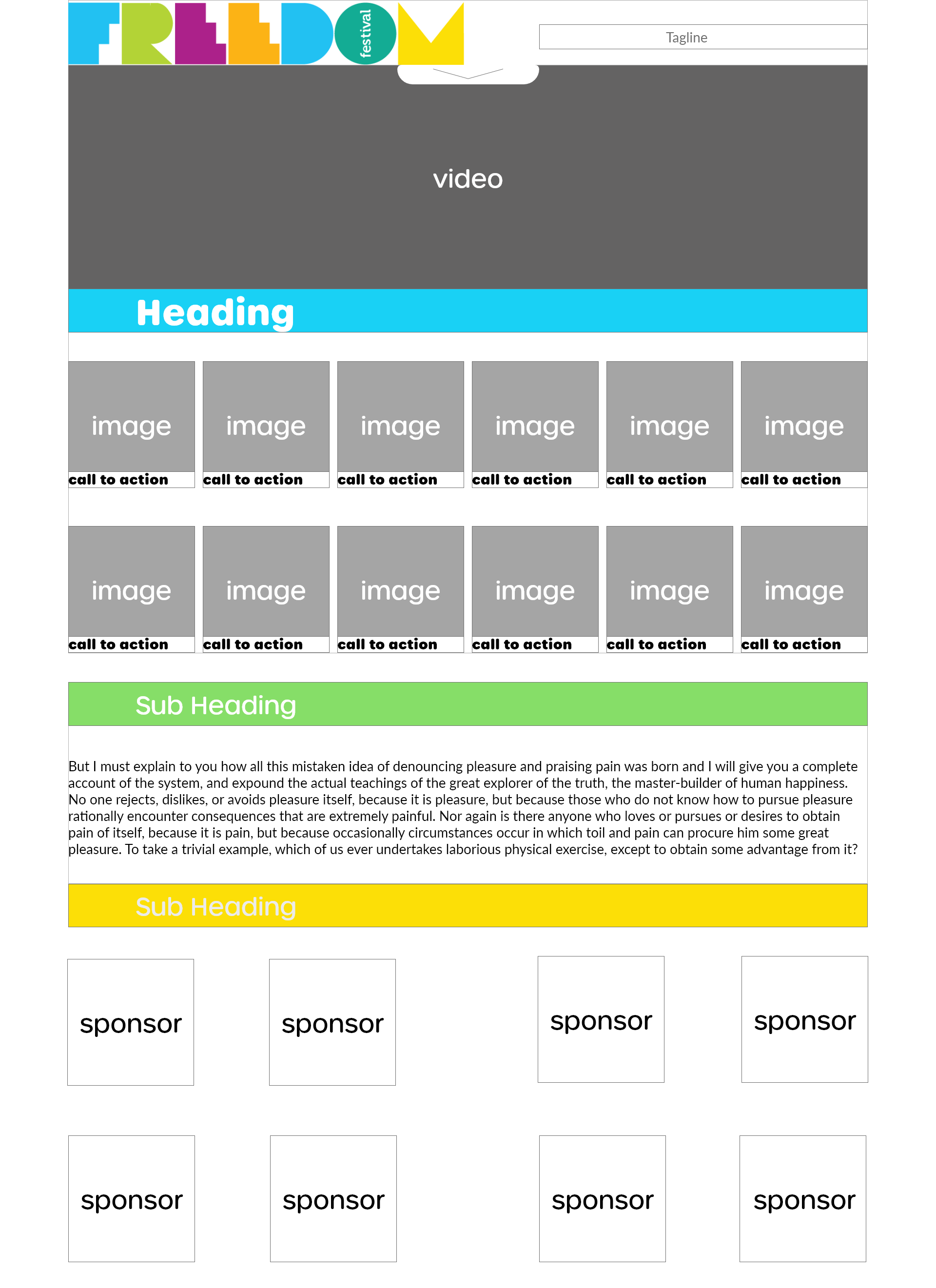
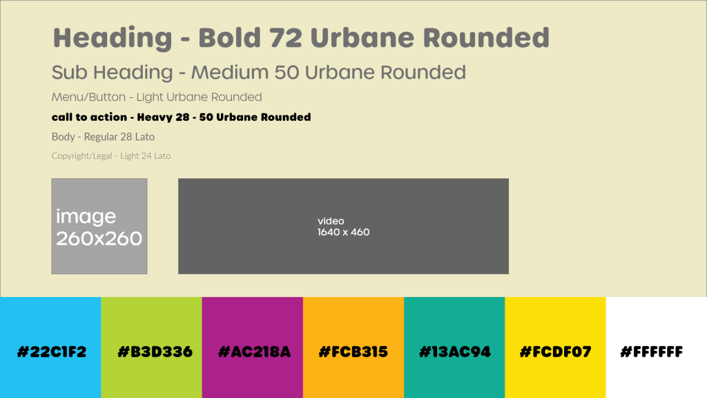
The typography used in these designs are using two separate fonts; Urbane Rounded is used for the headings, titles and calls to action. Chosen for its less professional,and more friendly appearance it does not have an ostracising feel to it, giving an intention that anyone of any age or demographic is welcome, to express that sense of inclusivity the Freedom Festival is known for. The other choice of font is Lato, which was chosen because of its clean look and presentation which felt suitable for use as body text within the webpage. The main goal for the body text was to have something that is easily readable by the audience. Lato can help with this by being a sans serif font that is distinguishable as a smaller font size, but does not detract from the overall theme of the webpage. The heading sizes and weights are distinguished enough to separate them subconsciously, and the choice of an extra thick weight for the call to attention was chosen due to its versatility at different sizes.
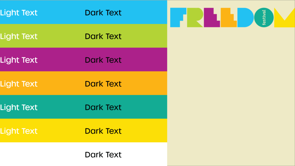
Deciding on the colour scheme was a difficult process as there was a desire to keep the original logo as a main component within the scheme. Due to its variety in colours it became difficult to find complimentary colours and tones to match the logo. The final decision was to use those logo colours as the scheme itself, in combinations with white and black, the colours could be used in a way to express the artistic view of the company, while also providing a universal theme within the pages. An alternate view that would be desired to be explored is an idea of allowing a collaboration within the page design to highlight a different local artist each year. By using a simple scheme as proposed here as a foundation or canvas to allow other artists to express their styles within the designs of different years events. Allowing a tailored and unique experience each year, that fits the overall view of the Freedom Festival.
The User Interface
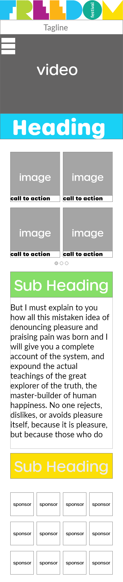
The next stage to look at is the user interface and understanding the choices and decisions made. The user interface of the webpage will incorporate typical design interfaces, the goal is to make the page accessible to all, easy to navigate and understand, and pleasant to view. A sense of simplicity is the ethos to keep at the core of the design process within this project. With that in mind a simple drop down menu system with an easy to follow directory. Each page would follow the same structure for this directory to allow an easy to remember system, following a layout template dictated by a grid structure to ensure a standard practice and cohesive structure to the overall display. With a simple overall design, it leaves room to explore a more artistic and graphical approach that could offer benefit in the form of identity expression. An opportunity to try out different responsive and interactive design approaches present themselves as less thought is needed to navigate the menu system with complex ideas and arrangements. In this approach there are a few different mockups of potential ideas to come into use that could offer a customised and engaged response with the audience.
An acknowledgement is needed when thinking of the user interface of how an experience can differ depending on the device used to explore the webpage. To include this cross device compatibility and ensure an effective design result, adaptations must be made to provide an easy user experience. To include this while incorporating the earlier ground rules that have been set out, the use of what is commonly referred to as a “burger menu icon” was an obvious decision to use in this scenario. To maximise the simplicity the structure of the menu navigation should follow a similar if not same system to the webpage that has been outlined. Again acknowledging that this allows room for a more creative approach to emphasise that self expression message that the Freedom Festival wants to portray. A final note is to explain the intention of being able to navigate to anywhere from anywhere, as such there will be a system in place to allow this notion, incorporating a previous page function into the navigation menu itself is the solution to this, while also offering a “fail safe” home navigation point within the logo.
Responsive Design Principles
Next to discuss are the responsive design principles used to ensure cross device compatibility. A Starting point within this is to take a mobile first approach, by designing icons, logos and assets for a mobile format first allows a more user friendly intention and provides an easier platform to scale up for the web page design. This can also fit into the ethos of simplicity that has been outlined earlier with the menu navigation, an overall positive implementation into the design. Another note in this process is the use of a grid system design, this has allowed a modular structure that can be modified and adapted to multiple formats and screen sizes without disrupting the flow of the information, again focusing on the user experience and allowing this simple journey to happen. The consistent branding that will be defined in this design process is a key consideration to note. It is important to understand that a non unified image between different platforms can cause confusion to the audience, it also gives an impression of a lack of organisation and disrupts the messages that are trying to be conveyed by the company.
Some important considerations to observe are the use of negative space in the design, on a smaller screen, a more filled out and cluttered layout can be jarring to the viewer. In a web page display it is easier to fill out the space and maintain the simplicity of the page. In this scenario it becomes apparent how the background can impose upon the information in the mobile view of the design, which unfortunately gives an overwhelming problem that needs to be addressed, but this displays the importance of understanding this concept. To continue discussing, the design of interactive elements such as buttons and clickable objects should have touch interactions in mind, to explain this means that they should be a reasonable size within all different applications, accessible in all formats and provide a sufficient response to the user input. Overall these methods make up the a majority of the design principles that will be implemented within this design project for the Freedom Festival to ensure an effective design in the cross device compatibility, which is an important aspect to provide a unified sense of identity within the branding and the visual self of the Festival and the company and its mission statement.
User Engagement
The user engagement within this Freedom Festival webpage is something that needs to be a focus; as the designer the goal is to have the product, or in this case webpage, maintain the attention and engagement of the audience. To do this a focus on how the user can be involved in the journey is needed, by following this mobile first approach the attention is drawn to how the user experiences the landing page. To effectively maintain engagement, the user needs to be given control, they should dictate where they go, when they go, and how they get there. An example of how this has been done is within the section of the landing page referred to as the “what’s on” section. Here there is a view of pictures of different artists and performances, the setup would allow the user to manually swipe through and view the selection at their own pace, this system translated into the webpage view adapts to display all the available artists due to the increased screen size. Another concept to be explored is the option of collapsible headings, which could increase the accessibility and solve the potential cluttered view issue by allowing the user to control what is available to view on their screen when, a simple minimise option displayed with an arrow could be implemented in this instance to achieve that. Scroll based animations can be incorporated to help navigation and engagement within the user experience, these animations are limitless in how they can be presented, emphasising key oceanography relating to the brand or character animations to help establish an identity, there are extreme uses to systems such as these that can enhance the performance and visual aspect.
Another option that has been implemented is the interactive button prompts that appear within this section and other call to actions displayed, by having a reactive system such as a highlight on hover, or a size manipulation, allows the user to subconsciously realise the current selection is a clickable object which in turn minimises the thinking power of the user which leaves them free to explore a personal opinion and view of the product themselves. This will be a consistent theme incorporated into the overall and final design as it is a common implementation that compliments the overall simplistic journey that is intended on being received by the user. The journey needs to be interesting enough to engage the user while not being overcomplicated in the systems and the presentation of itself, to fully diversify this an understanding of the accessibility needs of all users is something to be taken into consideration. As a potential feature to implement, an audio cue acknowledgement process could be incorporated into the design features of the webpage. Knowing there are concerns for accessibility, an approach to maintaining a balance of simplicity remains to be key within these thoughts.
Multi Channel Identity
The Multi Channel Identity has been discussed throughout, but the summary is that there news to be a unified brand image across all the channels. To do this a consistent use of colour, typography, iconography and compositional guides is required to unify this with each other. This can all be achieved through the use of a brand style guide, a system that provides a note on how all the different elements and objects should be applied. It informs anyone of the brand’s vision, its intention and how it should be portrayed and conveyed when used in a visual representation. In this situation the beginnings of this guide has been formed which has been developing throughout the full process of this project. A current state of how this brand visual is beginning to be informed and portrayed.
A final and important point of discussion and explanation of the accessibility considerations to deliver an inclusive user experience. A key step in this is to consider the disadvantages of inaccessibility and what can be done to increase the reach capabilities of this product. A main thought in this process is the idea of customizability, as a key message of the Freedom Festival is a welcoming environment. The idea of a user being able to tailor their experience, by adjusting the colours of the page, and the text. A standard practice is to offer a light and dark mode into web pages that can increase the readability of the page. With this implemented idea proposed, there could be a more detailed variety of options to enable a unique personal experience to an individual. A standard resizing option comes with the features of web browsers on desktop personal computers (pc) and mobile devices, so to allow full customisation allows a more in depth connection with the user. An exploration of this customisable menu option would allow this accessibility features to encompass a wider audience than normal, without detaching from a default experience the brand wishes to convey, through this there is also inclusivity to the community being presented. A directional emphasis could be placed on the intention that this webpage should be viewed as more of a companion app to the user, and its design presentation should be incorporated into that.
Conclusion
To summarise this post, the outline of this development process for this project is to present a rebrand and redesign of the Freedom Festival for 2024, to do that there has been an analysis and research into the design processes of web and app design for cultural festivals. That information has been collated and incorporated into the initial mockups, wireframes, notes, and guides that have been displayed. An outline and understanding of the Brand message and product goal has been displayed and discussed to convey the overall message. A key goal is to incorporate responsive design processes to ensure a welcoming and friendly page that displays a unified brand identity. To do this there has been an incorporation of standard grid design practices, along with adaptable typography, and iconography. A unified colour scheme has been decided and incorporated in a way that tries to achieve this expression and emphasis onto the arts and culture that the Freedom Festival is trying to achieve in its brand identity. This will help achieve a multi channel marketing experience that will in turn enable a wider audience reach and engagement that can be maintained through the use of the interactive systems in place to give control to the user. Finally acknowledged and discussed a reasonable way to achieve a broader accessibility range through the use of customisable options within a menu system upon page arrival. The collaboration of artists and organisations can help finalise and encapsulate that feeling of togetherness and community that is trying to be achieved within the brand message.