During the final exercise, it would involve prototyping, testing and evaluating. Throughout the journey of these exercises, there have been new skills learnt and new ideas discovered, and old ones enhanced. An important part of a successful user interface is a key branding message that the design follows, this is naturally achieved through smart composition, typography and colour. In this exercise a mockup prototype was developed as an accumulation of everything learned and discovered. It uses a combination of different ideas from earlier wireframes and acknowledging it being a prototype will mean it will definitely continue to go through a multitude of revisions before final display. The most important aspect to show in this prototype is the vision within the user experience in what is trying to be achieved. During this process, multiple components were designed up and created for use within this prototype. Utilising the feature of the asset library the experience of efficiency within adjusting and changing certain aspects of the document design increased which allowed for certain areas of focus and development to be honed in on.
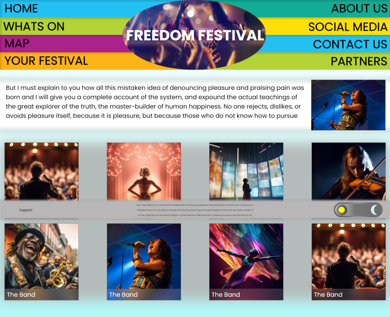
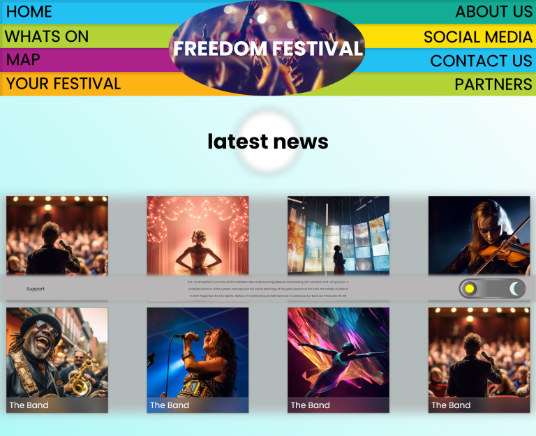
Giving the user control is the first priority, and so the primary navigation was designed to be one of the first thing viewed, so the user is immediately aware of what they have available to them, accompanied by a dynamic video playing as the background for the logo header, provides a quick insight into the festival and what it is trying to promote. Each of the menu bars is intended to be interactive, that offers visual feedback when highlighted, using a hover state in the component section. The design intention for the navigation is to provide the extra windows as an overlay rather than a new page, the implication being to keep the user locked into one place to avoid confusion in navigating. A simple click to read the information and click to close mechanic provides that depth of exploration while maintaining a simple path to follow. To provide even more dynamic interaction the latest news section of this page was made using the auto animation feature provided by Adobe XD. This allows for a visual of how animated components would appear to the user and helps the designer realise what can amplify the design, an immediate improvement would be to make this into an actual animation of some relevant topic which could enhance the experience more.
The lower information bar has been applied with a fixed in place during scroll toggle, to provide a visual break in the information to prevent the user from becoming overstimulated and frustrated at what is being presented. And the artist pages have been given a hover state as well to allow the user to instantaneously recognise what can be interacted with and what can not be. The final component to mention is the dark mode toggle presented on this information bar, it uses a toggle state that switches from light to dark when clicked. During this modern era, accessibility is becoming talked about more and more and as it becomes a more conscious part of design it is important to understand and utilise ways to enhance every person’s experience and allow it to have the maximum reach possible.